Here’s how I helped
Bundling products
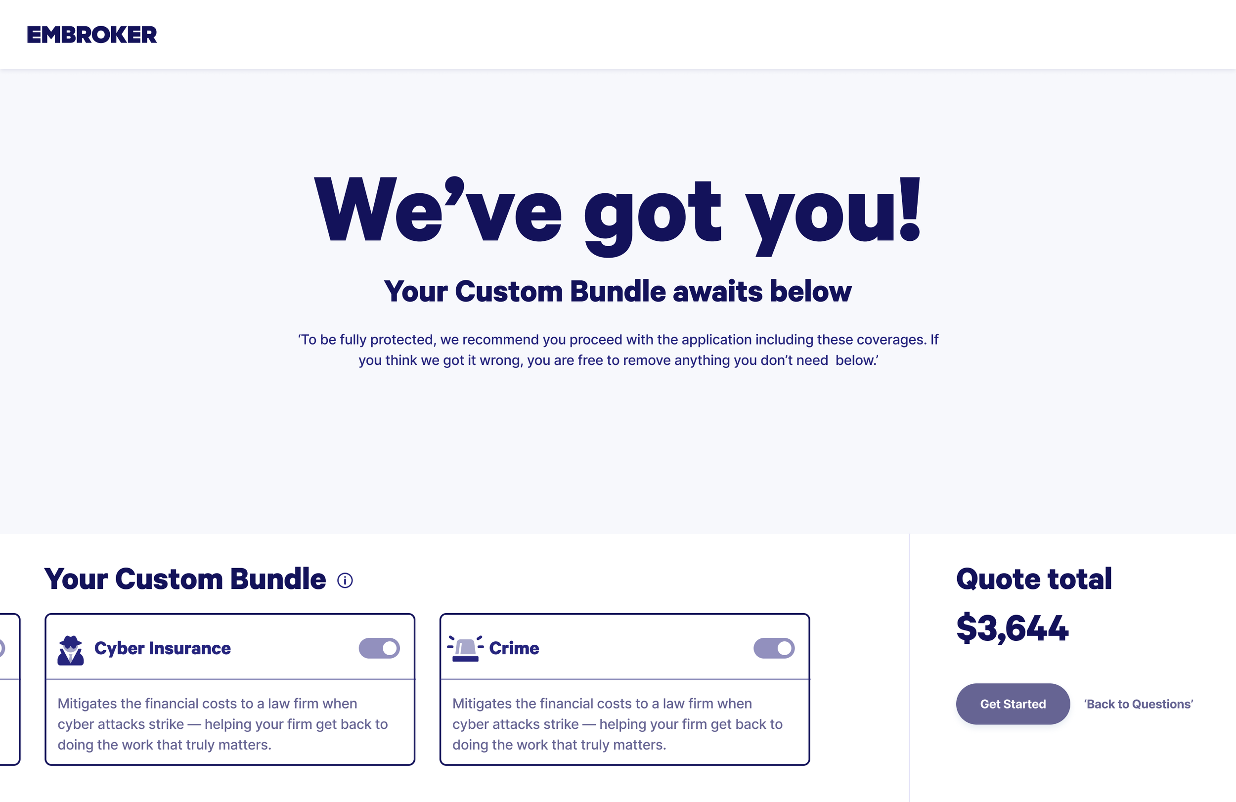
I leveraged Useberry findings to improve insurance product selection for new users

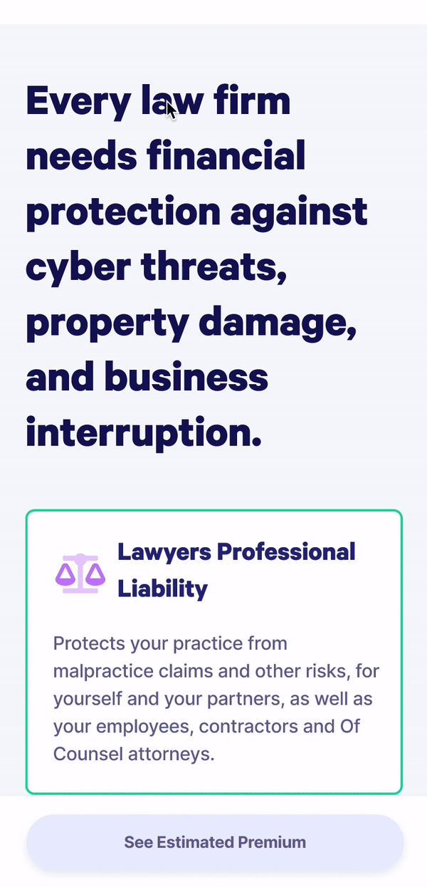
Law firms deal with risks that go beyond professional liability, from cyber threats to everyday operational challenges. Adding coverages like Cyber Insurance or a Business Owner’s Policy creates a stronger safety net, giving firms broader protection against both digital and business vulnerabilities.
Understanding the problem
Law firms face risks that go far beyond basic coverage, they need insurance tailored to their most pressing vulnerabilities. With large amounts of sensitive data, they’ve become prime targets for cyber breaches, making cyber protection essential.
Embroker’s bundle is designed with this in mind. It combines professional liability coverage with cyber insurance, offering clear pricing and solutions built around law firms’ unique needs. According to the 2022 ABA Cybersecurity Tech Report, 27% of firms have already experienced a breach - proof that cyber coverage is no longer optional but critical.
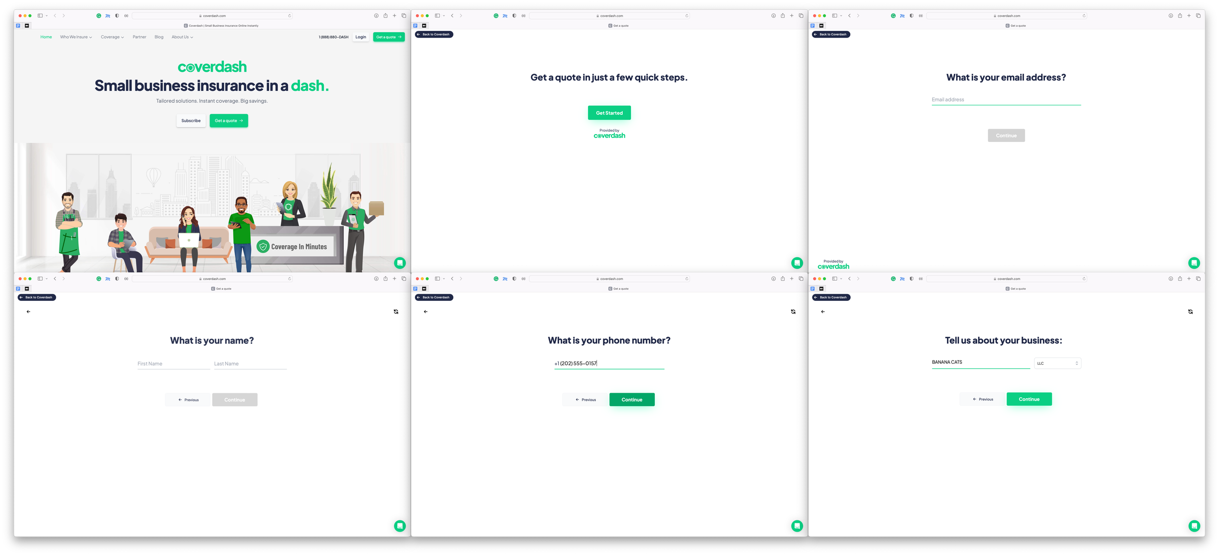
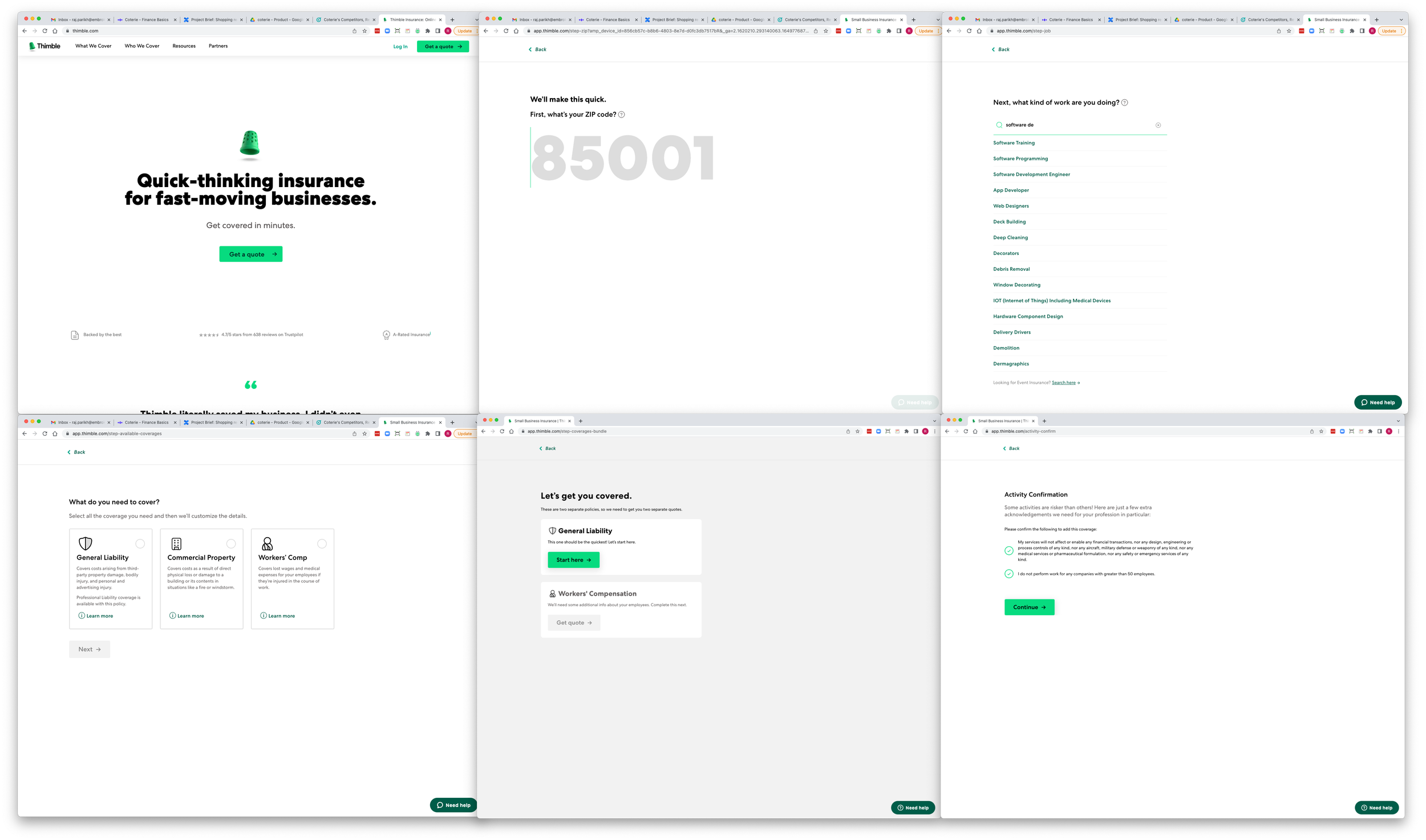
Competitive analysis: Using progressive disclosure in onboarding
In reviewing competitor products, I found that many use progressive disclosure to strengthen their onboarding flows. By revealing information step by step, this approach keeps users from feeling overwhelmed, while encouraging engagement and helping them better understand what’s in front of them. These insights showed us the value of applying progressive disclosure in our own onboarding, making it more intuitive, approachable, and user-friendly right from the start.
Utilizing empathy maps to understand law firm needs and motivations
For this project, I created an empathy map to better understand what drives law firms when choosing insurance. This tool helped me step into their perspective, capturing not just their practical needs but also their concerns and motivations. It revealed how firms respond emotionally to complex issues like cyber threats and liability coverage, and what challenges shape their decisions.
By mapping these insights, I was able to design solutions that addressed both their business requirements and their underlying anxieties. The result was an approach that felt not only relevant but also empathetic - building offerings that truly connected with the realities law firms face.
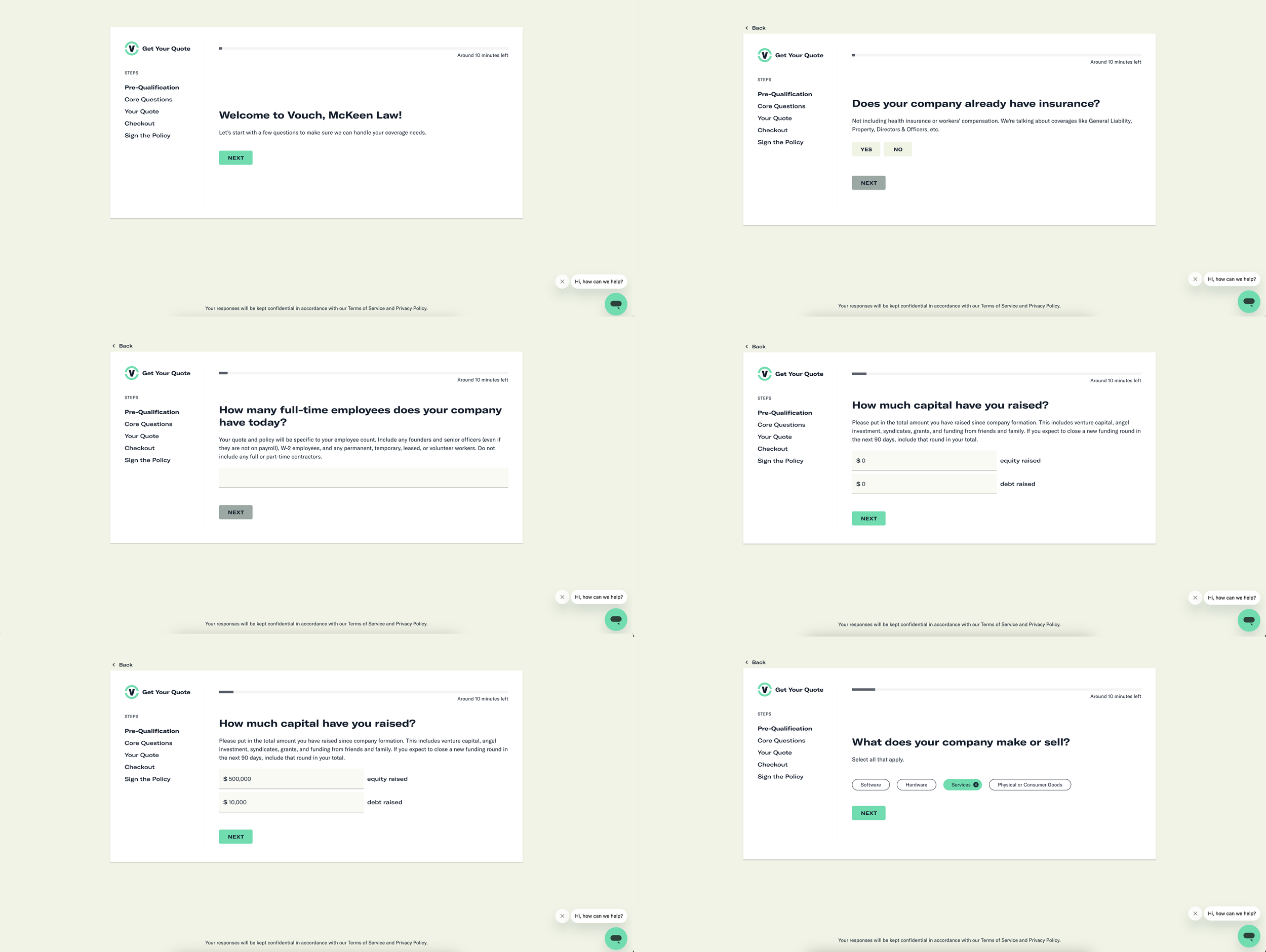
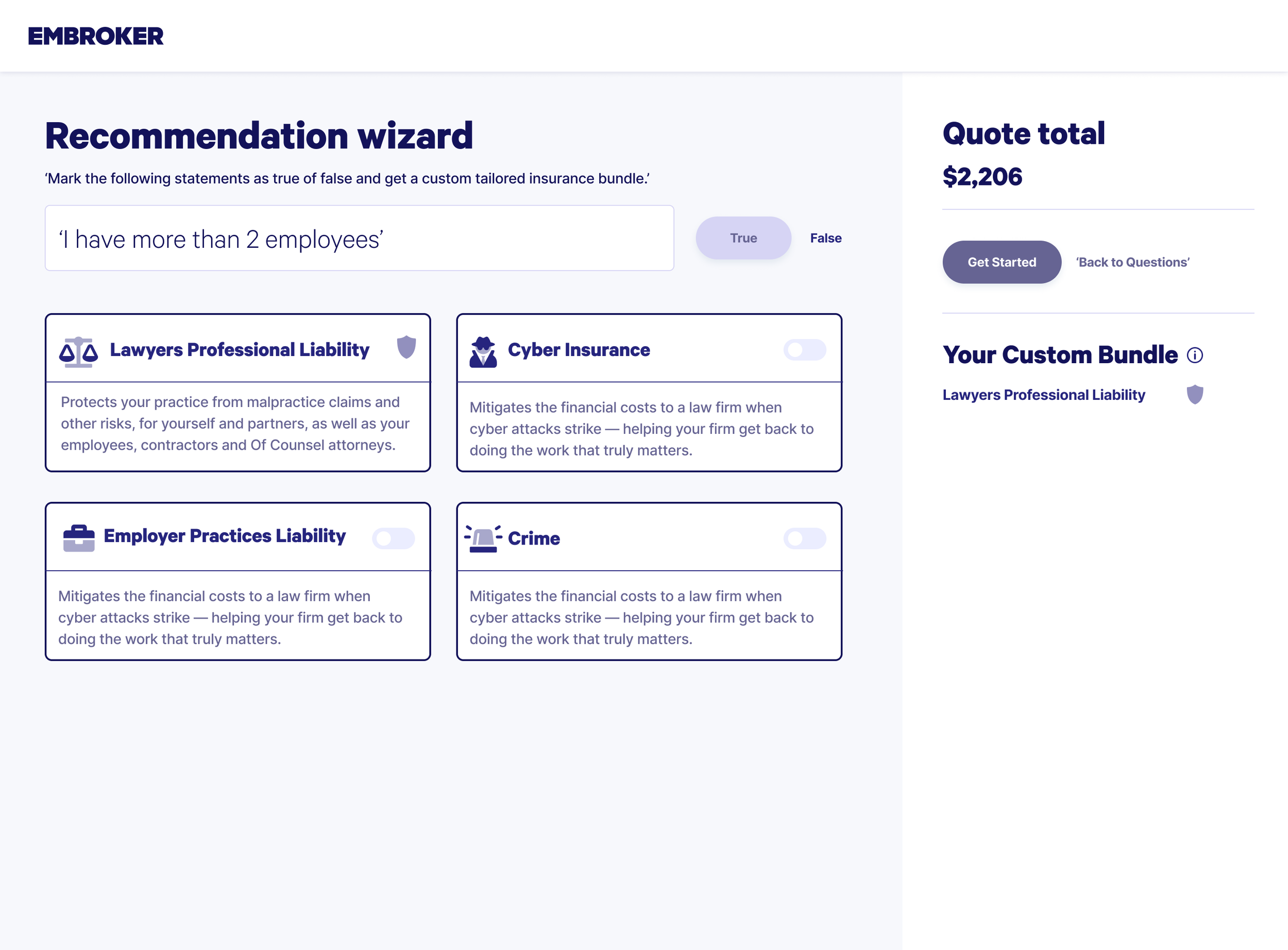
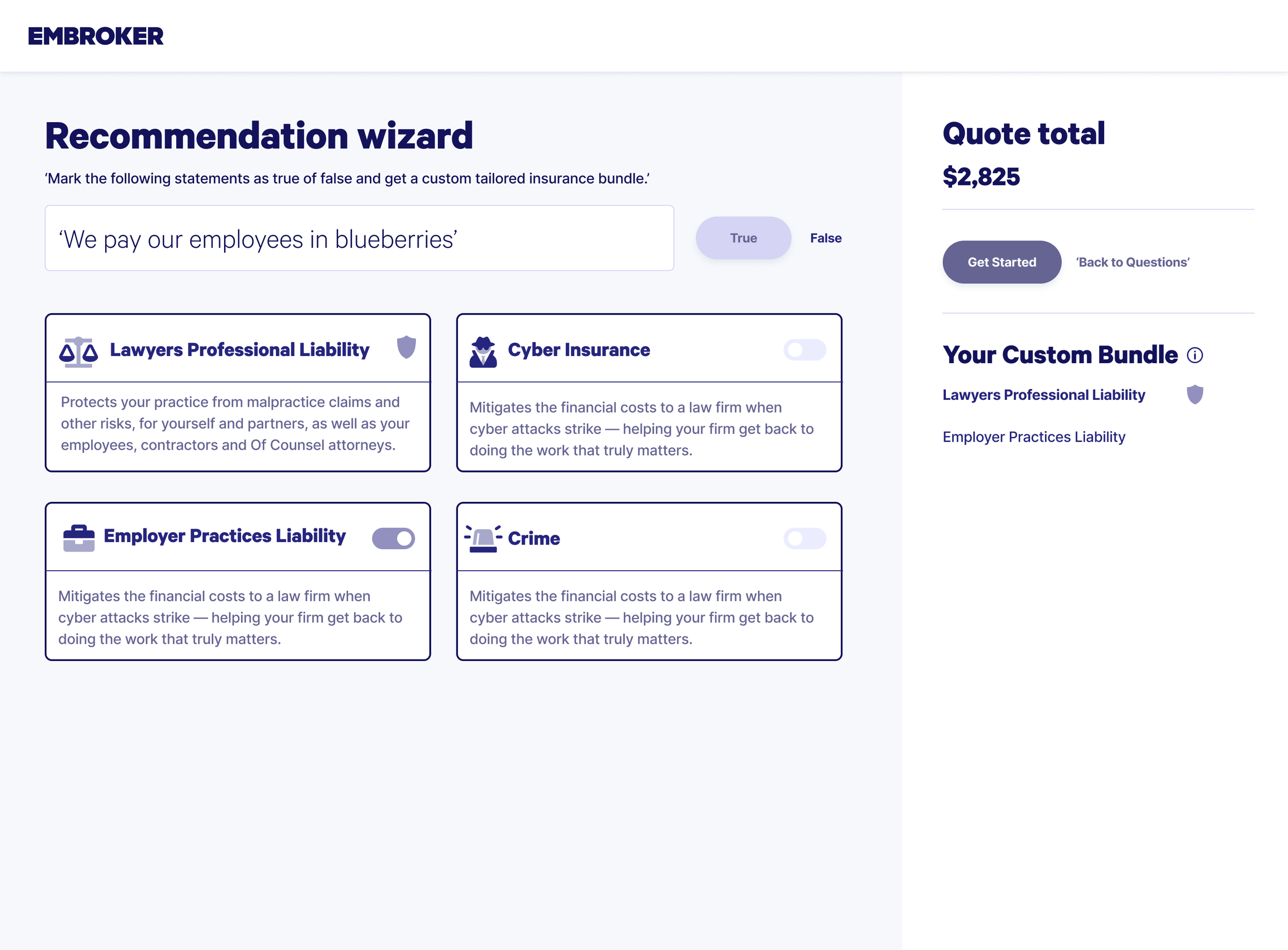
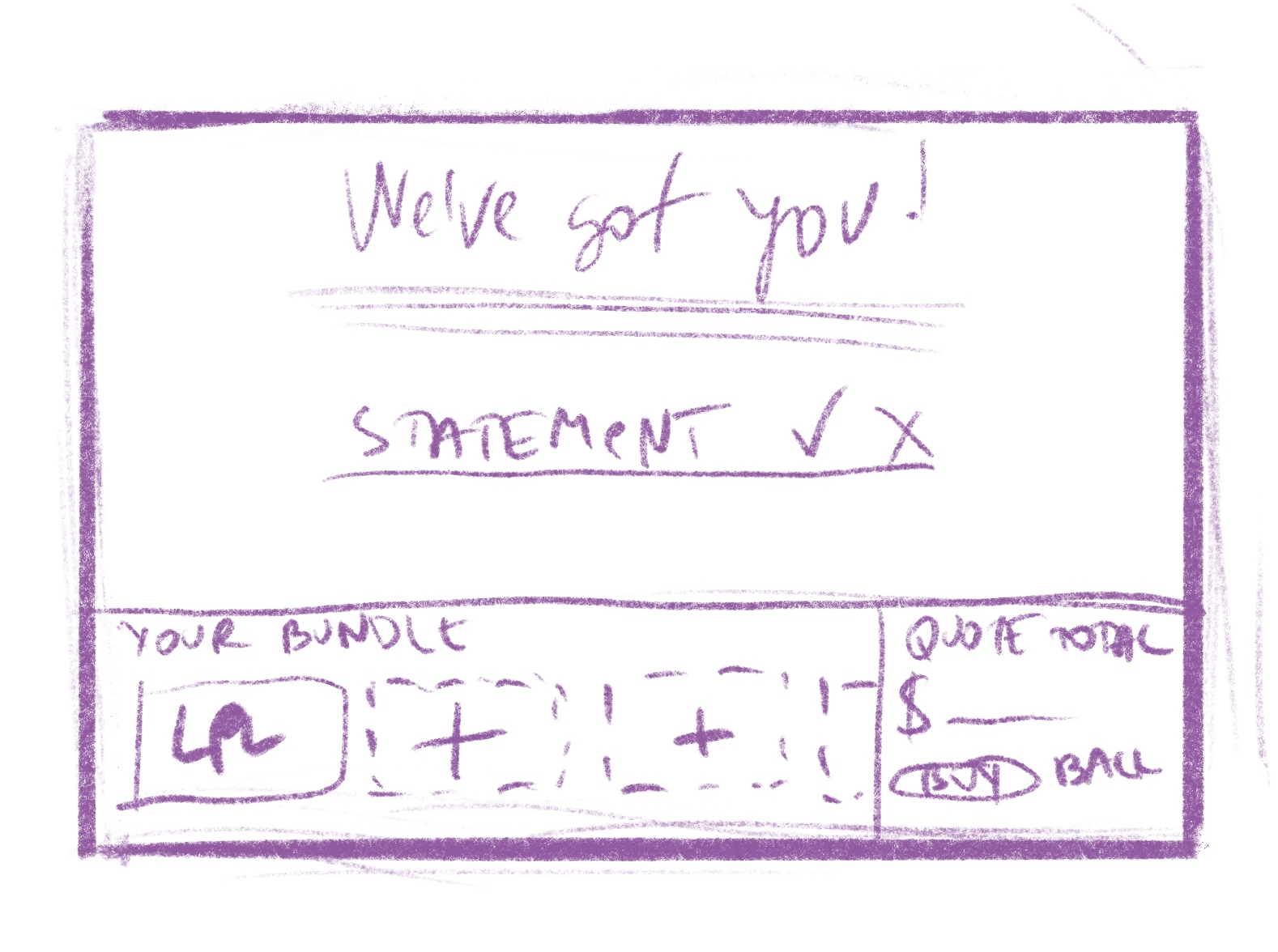
Wireframing process and early design experimentation
When designing how to introduce additional coverages alongside Lawyers Professional Liability, I leaned on wireframes and low-fidelity mockups to explore different approaches. These early iterations were a safe space to experiment with how to present extra coverage in a way that felt natural, even though bundling didn’t come with obvious cost savings.
The strategy was to create an experience where users could connect the dots themselves, seeing the relevance and benefits of products like Cyber Insurance or a Business Owner’s Policy without feeling pressured. By testing different layouts and flows, I focused on guiding users through a discovery process that made the value of comprehensive protection clear, while still leaving the final decision in their hands.
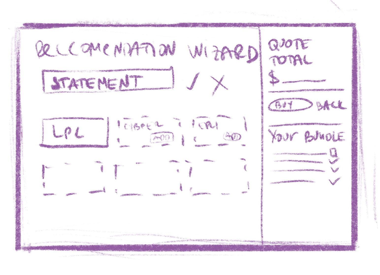
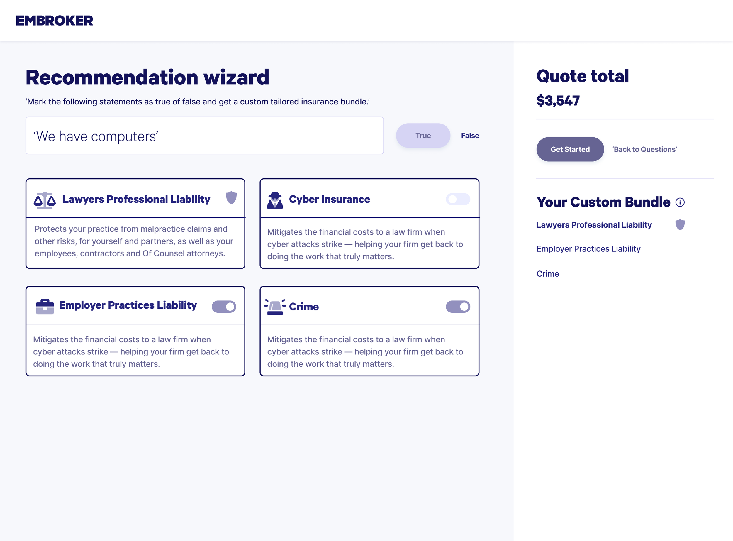
In the ideation phase, I ran into technical restrictions that limited how we could present multiple coverages. This pushed me to think creatively about how to encourage users to see the value of adding more protection, even within those constraints.
I explored different design patterns and user journeys that could gently guide users toward recognizing the benefits of broader coverage. The aim wasn’t to push them, but to craft an experience that made the advantages feel clear and relevant. This stage challenged my adaptability and resourcefulness, as I worked to design solutions that balanced technical limitations with the goal of helping users make well-informed insurance decisions.
Applying Jacob’s Law to create familiarity
In this phase, I drew on Jacob’s Law, the principle that users spend most of their time on other sites and expect your product to work the same way. Inspired by the online shopping experience, I applied this thinking to the design of the summary tab.
The goal wasn’t to copy e-commerce directly, but to borrow familiar patterns that users already understand. By aligning parts of the quoting flow with the structure of a shopping checkout, I aimed to make the process feel more intuitive and comfortable. This subtle familiarity helped reduce friction, streamline decision-making, and encourage stronger engagement with the insurance selection process.
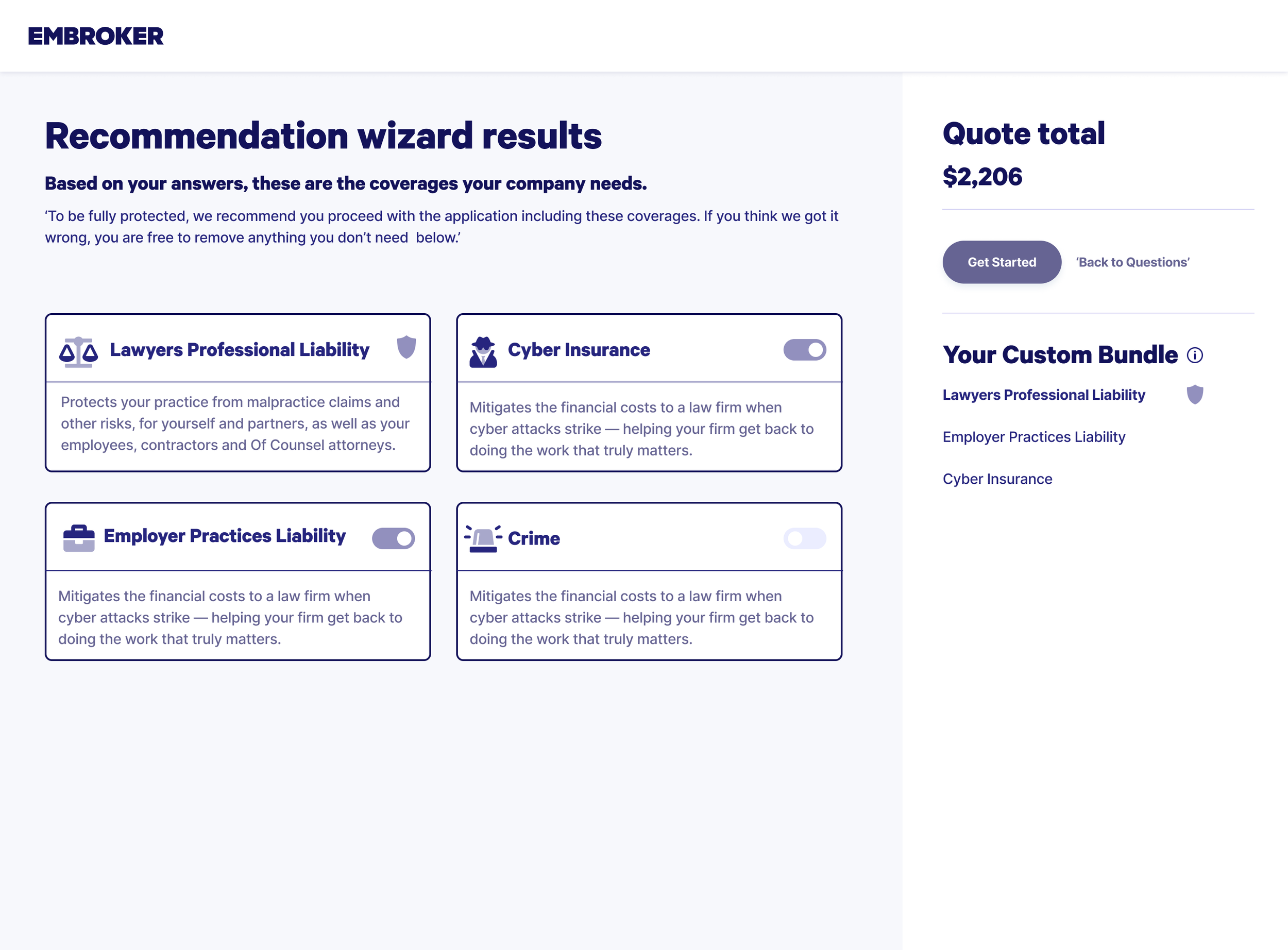
Using social proof to build confidence
To support decision-making, I applied social proof by labeling certain insurance options as “Recommended.” This draws on the psychological principle that people feel more confident choosing options that others have already validated.
The label served as a quiet nudge, signaling trust and reliability without overwhelming the user. By framing some coverages as recommended, the design offered reassurance and made it easier for users to feel confident in selecting products that were seen as proven and dependable.
Unmoderated user testing results and heatmap insights
We ran an unmoderated test on Useberry to evaluate a two-part flow in the insurance application. Participants moved through the journey on their own, giving us a clear picture of how the design performed without external guidance.
The heatmaps and interaction data revealed where users hesitated, where they clicked with confidence, and where confusion slowed them down. These insights helped us pinpoint friction points in the flow and identify opportunities to simplify navigation, clarify language, and streamline the overall experience.
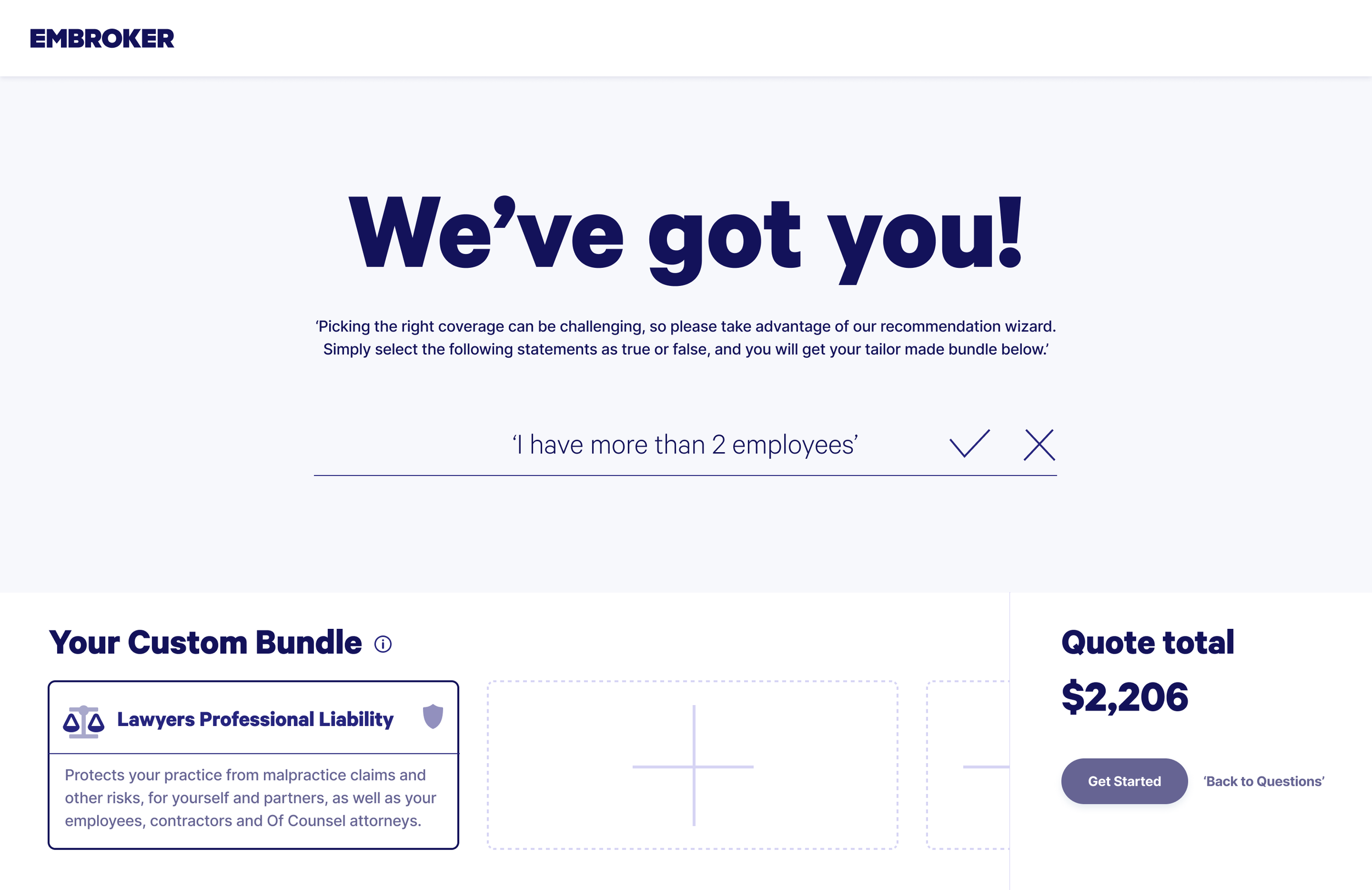
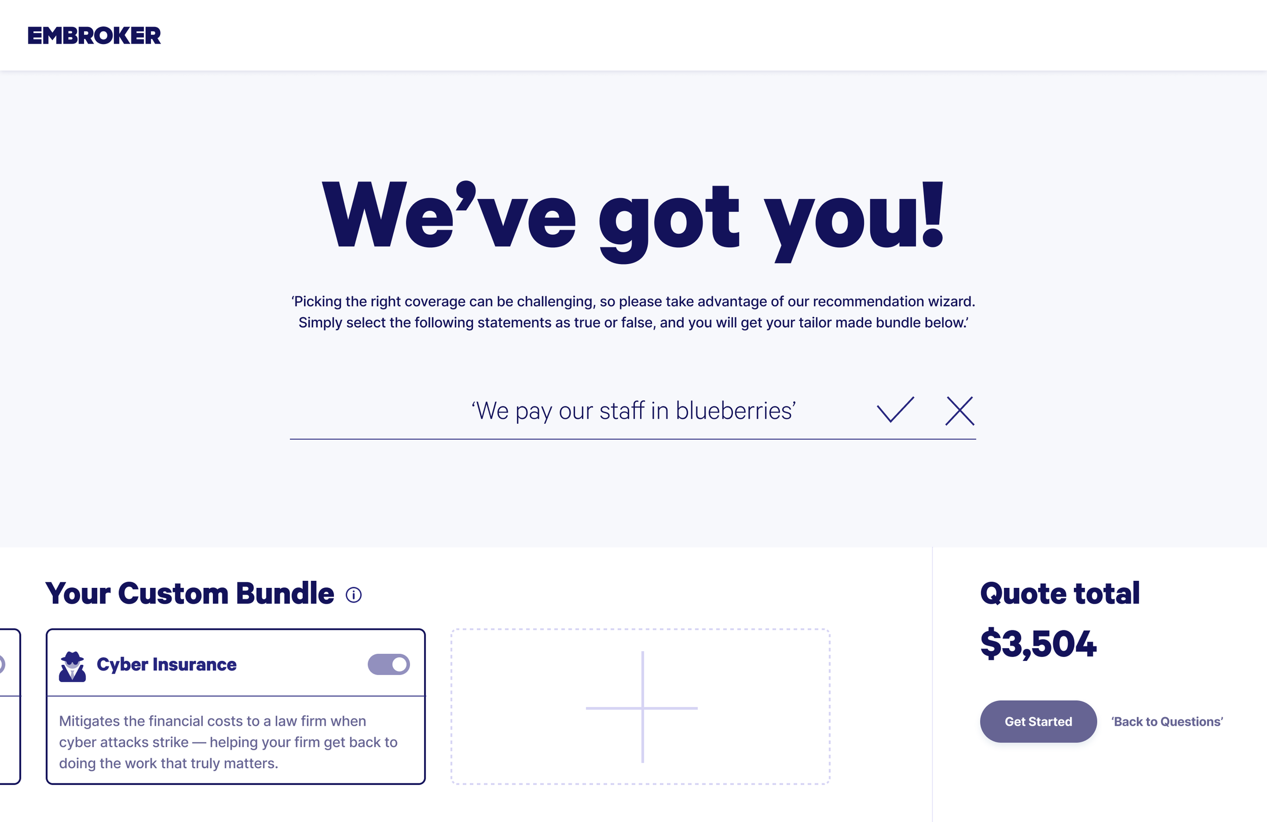
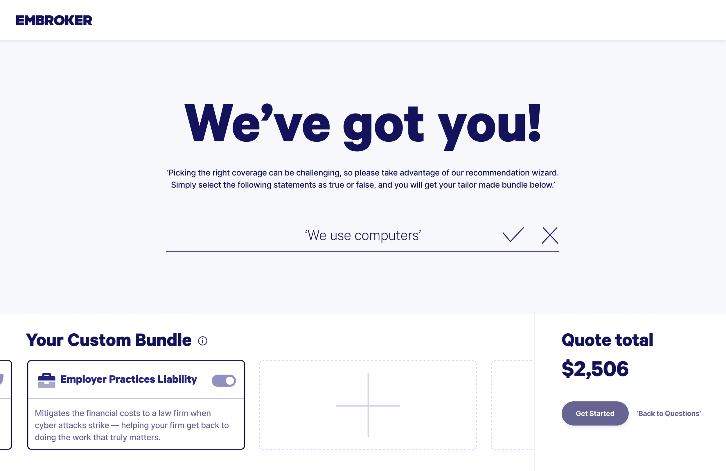
Part 1: Quote Estimate Questions
In the first stage, users answered four questions to generate a quote estimate. The test measured how clear the questions were, how easy it was to input responses, and the overall experience of moving through the flow. While users understood the questions, many felt there were too many clicks before reaching their estimate, highlighting the need to streamline the process.
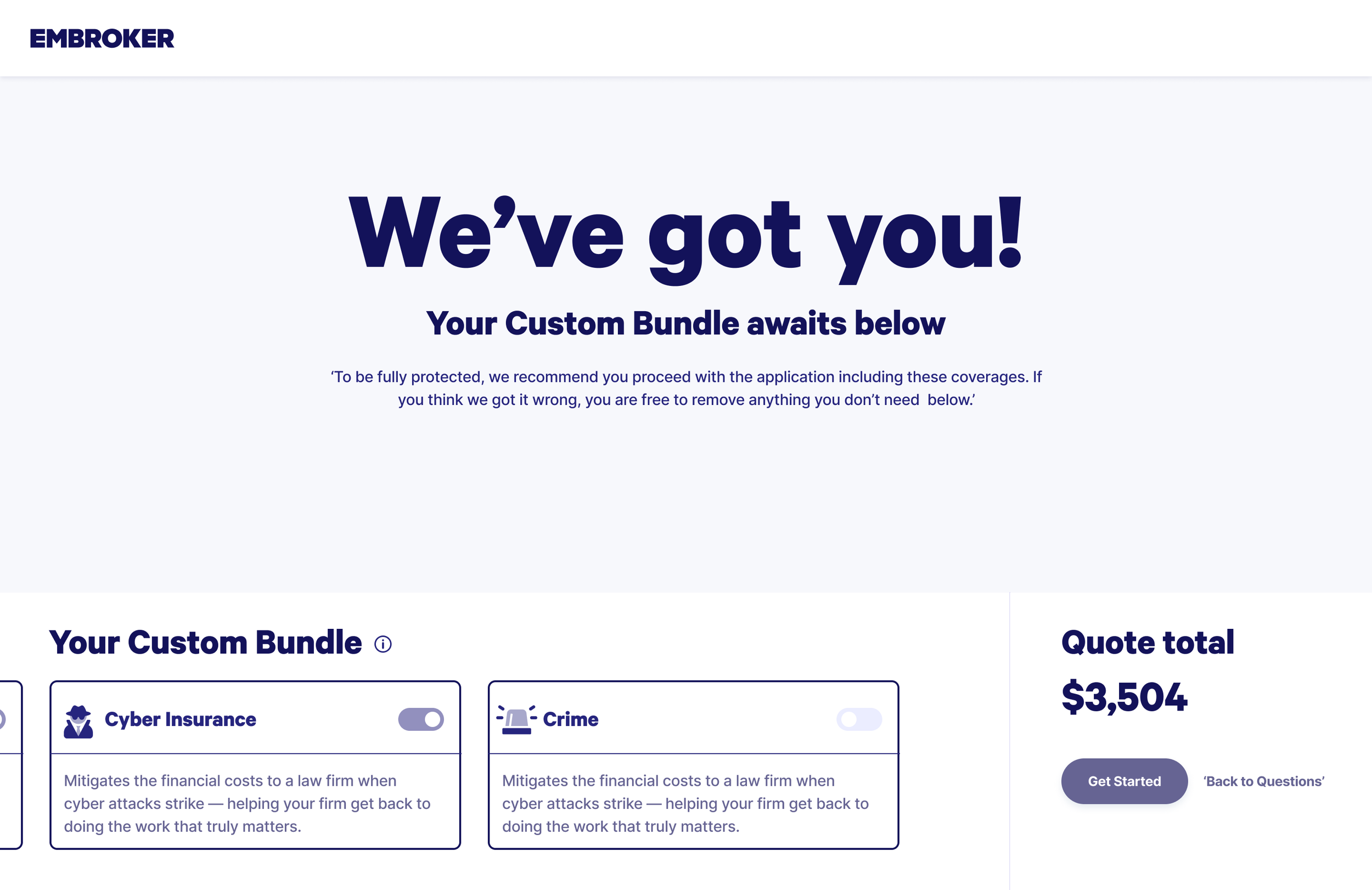
Part 2: Coverage Selection
The second stage focused on choosing insurance coverages to complete the application. Here, we tested how intuitive the selection felt, whether the information for each option was clear, and how satisfied users were with the flow overall. These insights gave us direction on where to simplify interactions and strengthen the clarity of coverage details.
Key findings from the Useberry test were:
While questions were clear, users expressed a need for fewer clicks to improve efficiency
Users liked the layout of coverage options but wanted more details on certain coverages
Fast generation of quote estimates was appreciated
Overall, the flow was user-friendly, but some areas needed refinement for better user experience
The heatmap analysis showed that users completely overlooked the banner meant to explain the benefits of extra coverage. This gap revealed that critical information wasn’t reaching them at all. Based on this insight, we reconsidered how and where the banner appeared, exploring changes in placement and design to make sure users actually saw and engaged with the message.
Final designs: refining and implementing user feedback
In the final stage, I focused on building responsive designs that worked seamlessly across desktop and mobile, ensuring users had a consistent experience no matter the device.
Guided by Tesler’s Law (the idea that some complexity is unavoidable) I worked to strike the right balance. The goal was to keep the interface intuitive and approachable, while still accommodating all the essential functions and details the quoting flow required.
The result was a design that handled the inherent complexity of insurance selection without overwhelming users, delivering a smoother, more accessible experience across platforms.
Design for desktop
Design for mobile