Quoting multiple policies
I enhanced the quoting process by achieving user clarity and efficiency
Here’s how I helped

Quoting in digital insurance is complex: multiple coverages, endless options, and different eligibility paths. Yet the user still expects it to feel simple, clear, and seamless.
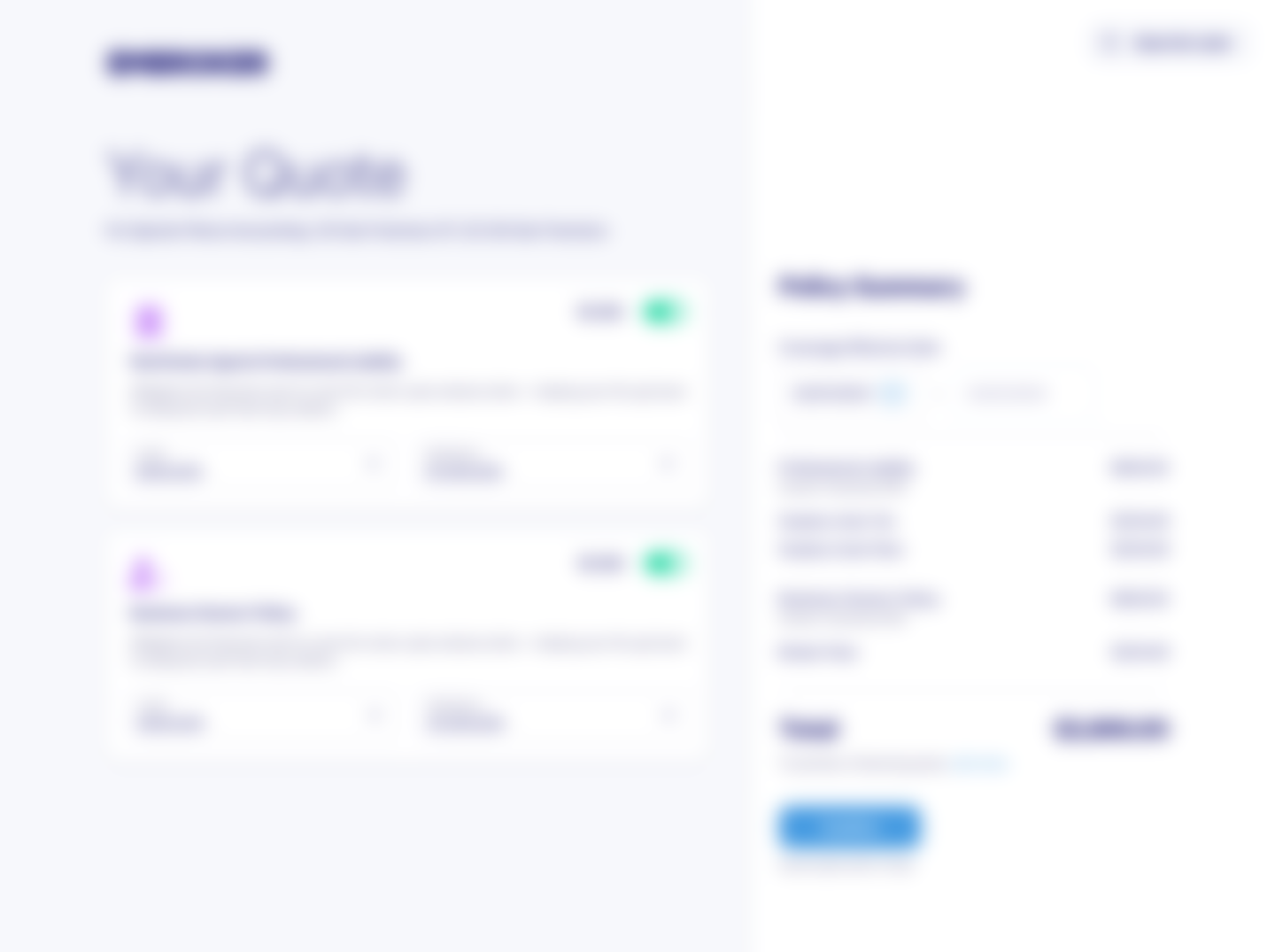
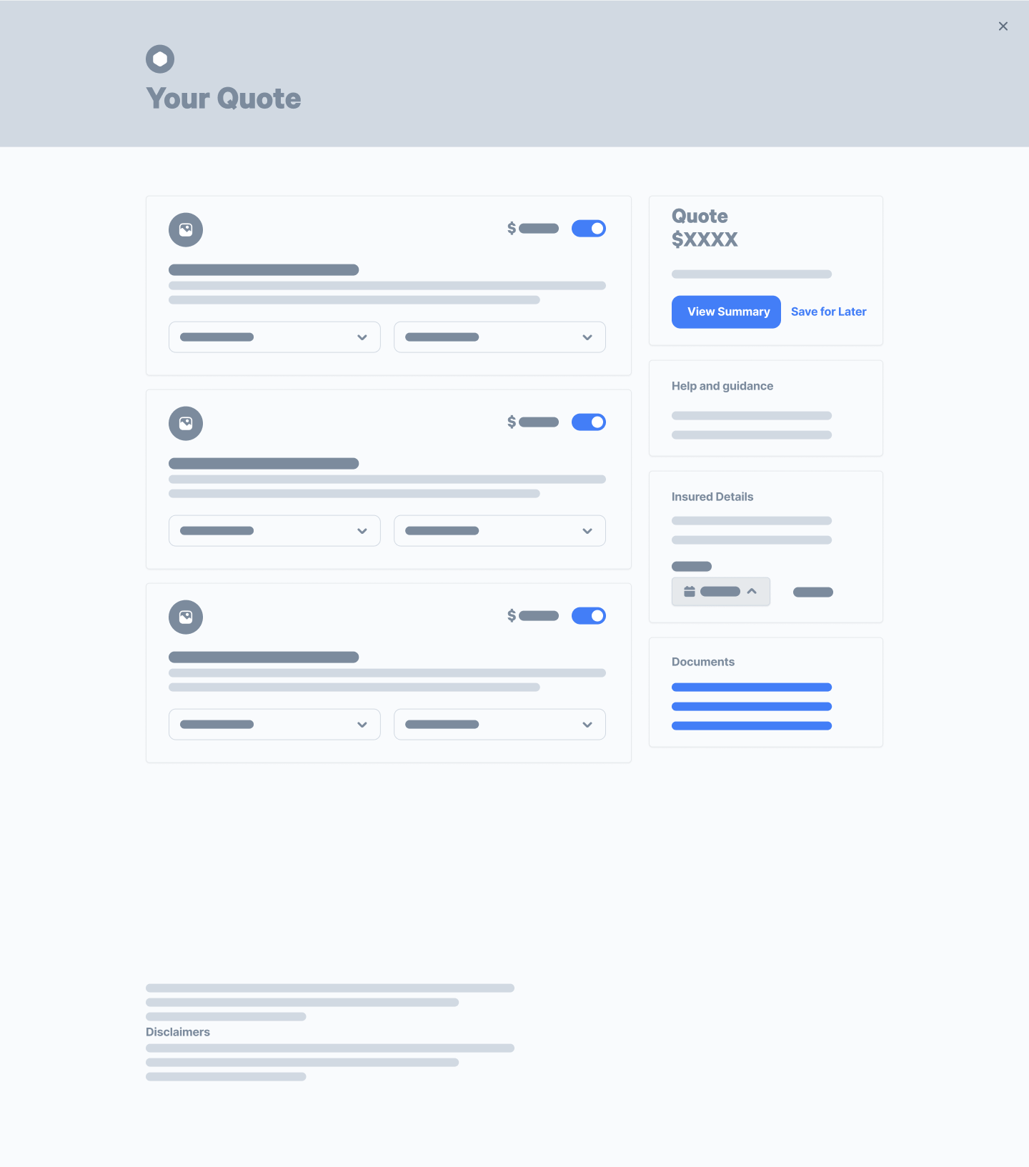
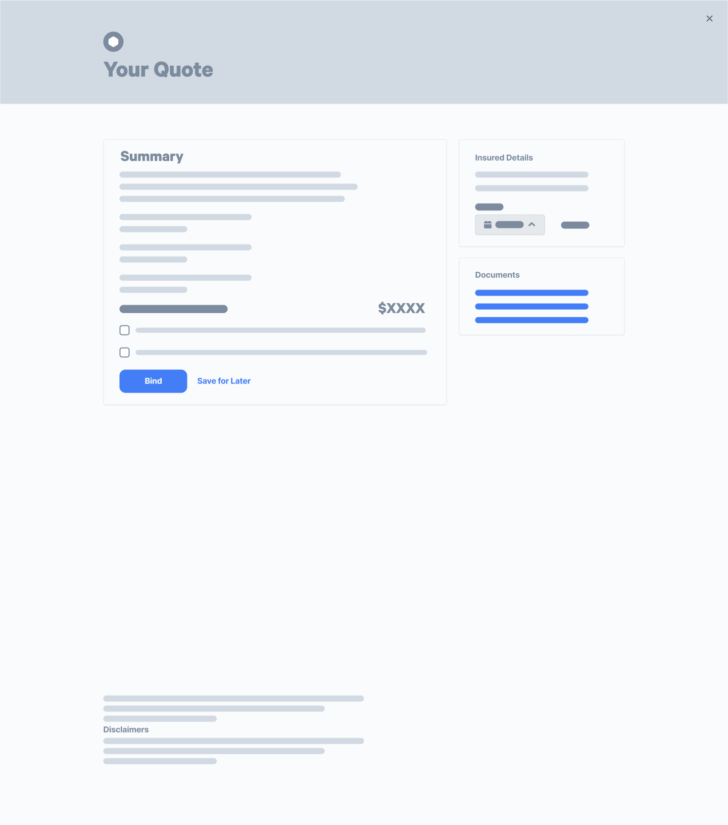
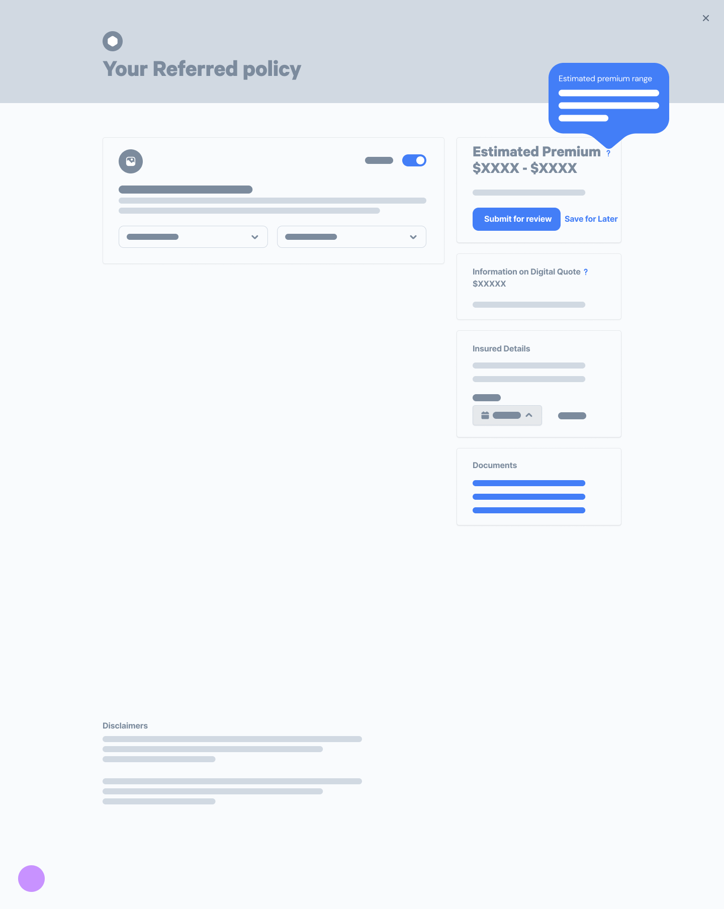
Presenting quotes to users in digital insurance involves a complex array of components, even for a single coverage. Users must navigate through various customization options like limits, retentions, and deductibles, while also having the flexibility to select their coverage start date. It's crucial to provide them with easy access to downloadable documents, such as the specimen policy and application summary. Additionally, clear communication regarding the total cost is essential.
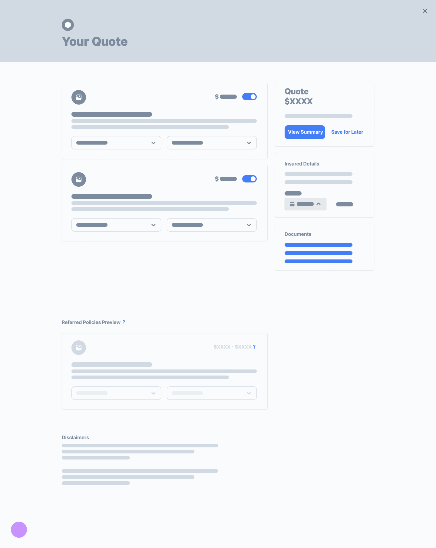
Introducing multiple coverages into this process adds further complexity, not only due to the increased number of options but also because each application can follow one of three paths: eligible, ineligible, or referred. In cases marked as referred, the underwriting team must review the application to determine eligibility, often due to certain responses that render the application less straightforward. This scenario underscores the intricate nature of the quoting process in digital insurance and the challenges in designing an experience that is both comprehensive and user-friendly.
User persona
We built the user persona through a collaborative process. The analytics team first gathered insights, then UX, Product, Marketing, and Customer Success came together in a workshop to turn those findings into a detailed persona. After validating it with real users, the UX team refined the draft so it could effectively guide product decisions for small accounting firm owners.
Challenge: designing a quoting flow that kept users engaged while handling referrals.
Solution: reworked the flow to align with technical limits, simplifying the overall process while keeping the experience user-friendly
Flowcharts were a key tool in mapping the quoting process, and I worked closely with the product owner and backend lead to shape them. My first draft separated referrals from quoting, so users could bind eligible policies while waiting on underwriting decisions. The idea was to keep users engaged instead of losing them during the wait.
But in review, the backend lead flagged a critical issue: this setup would create multiple policy start dates, which complicated how charges were calculated. With the technical limits in mind, we reworked the flow to resolve that issue. The updated version simplified the overall process, though it did add complexity to some individual screens. It was a necessary tradeoff to balance user needs with system capabilities.
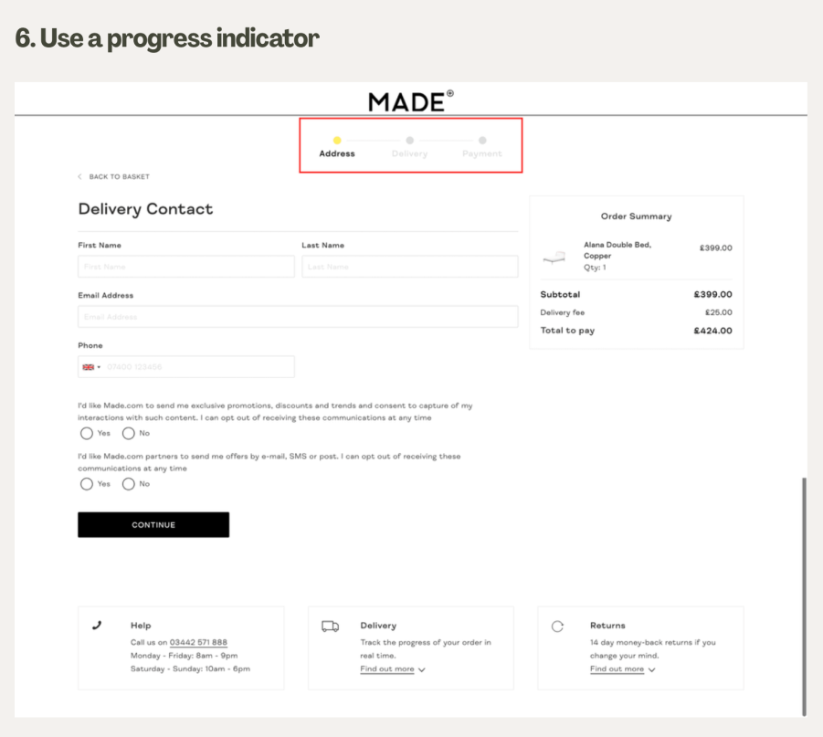
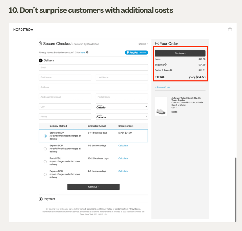
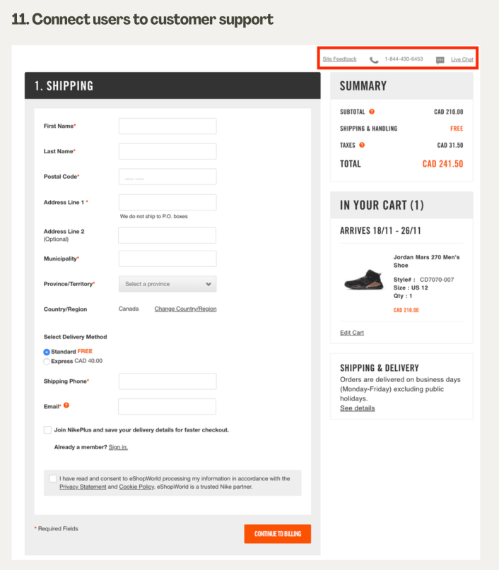
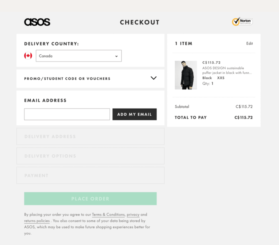
Learning from checkout UX
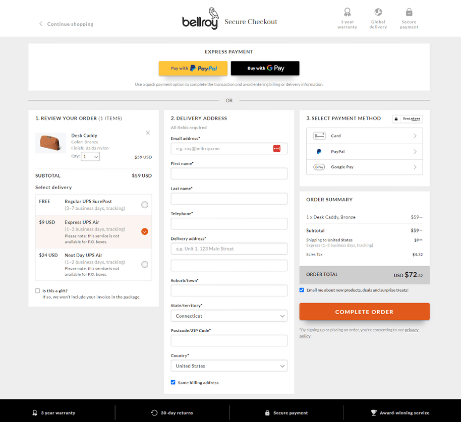
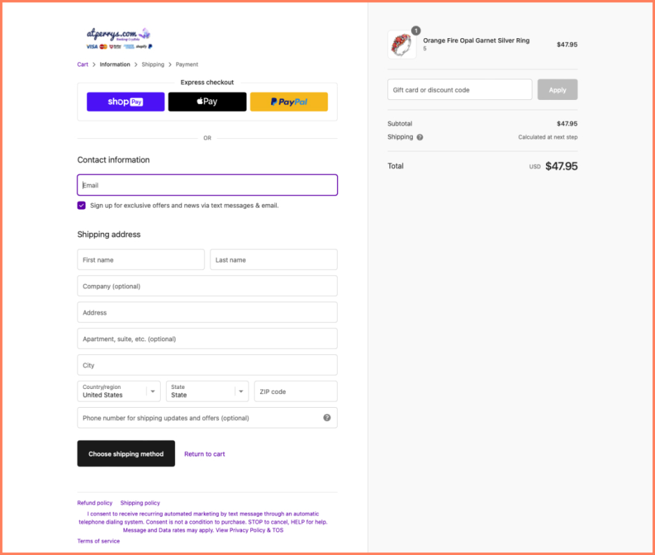
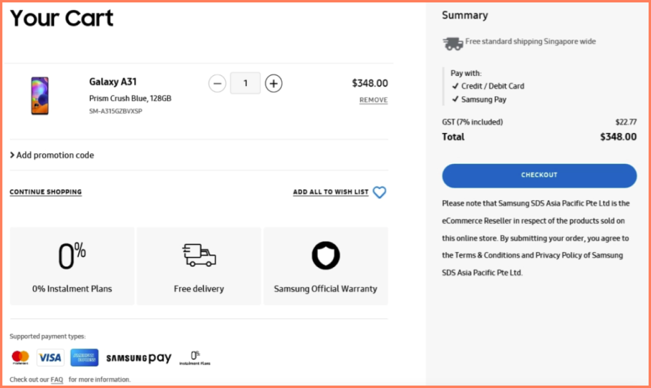
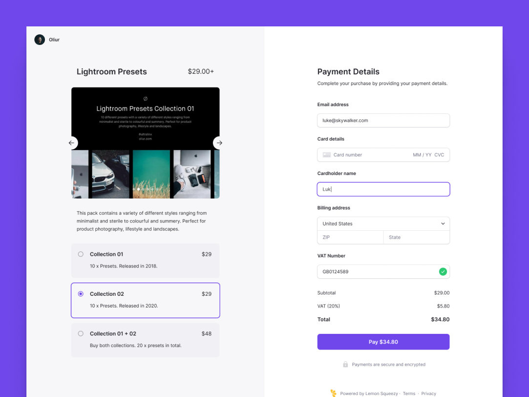
To refine the insurance quoting experience, I looked to e-commerce checkout flows for inspiration. Finalizing a quote works much like completing an online purchase and research shows that about 70% of checkouts are abandoned¹. That makes a smooth, intuitive process essential.
The main culprits behind abandonment were unexpected charges, forced account creation, overly complicated steps, and performance issues. With these insights, we shaped the quoting flow to avoid those pitfalls: reducing drop-offs, improving satisfaction, and making it more likely users would complete their insurance purchase.
1 bolt.com/blog/reasons-for-checkout-abandonment
Low-fidelity wireframes for early alignment
At the start of the project, I used low-fidelity wireframes to share design concepts with stakeholders. These simple visuals focused on structure and flow, making it easy to discuss the core ideas without getting caught up in details like colors or typography.
This approach opened the door for clear conversations, quick feedback, and early alignment on user experience goals. It also ensured that everyone was on the same page before moving into high-fidelity designs—saving time and building a stronger foundation for collaboration.


Modernizing the look of all digital quoting pages
BeforeAfterThis project wasn’t just about improving the quoting flow, it was also about giving all quoting pages a modern, cohesive look. Using Gestalt principles, we grouped related details together (like the quote expiry date and quoted premium) so users could process information more intuitively.
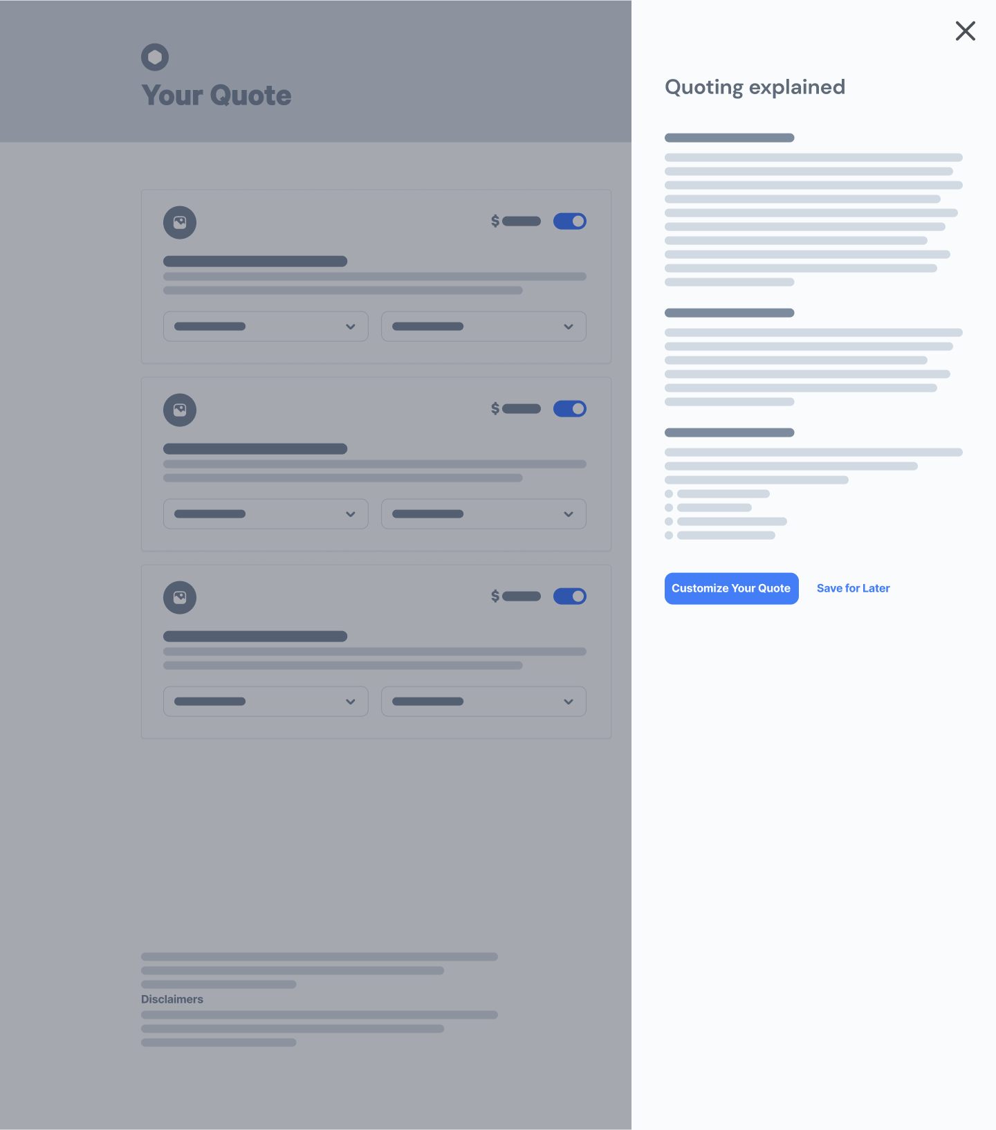
Because insurance language can be intimidating, we added tooltips throughout the interface to explain terms in plain language and reduce anxiety. We also swapped out the permanent-feeling ‘X’ to remove coverage with toggles, encouraging users to explore options without fear of losing progress. Finally, we replaced the generic ‘Close’ button with a clearer ‘Save and Exit,’ reassuring users that their work would be saved.
Together, these updates modernized the visual design while also making the quoting experience feel simpler, friendlier, and more secure for users.
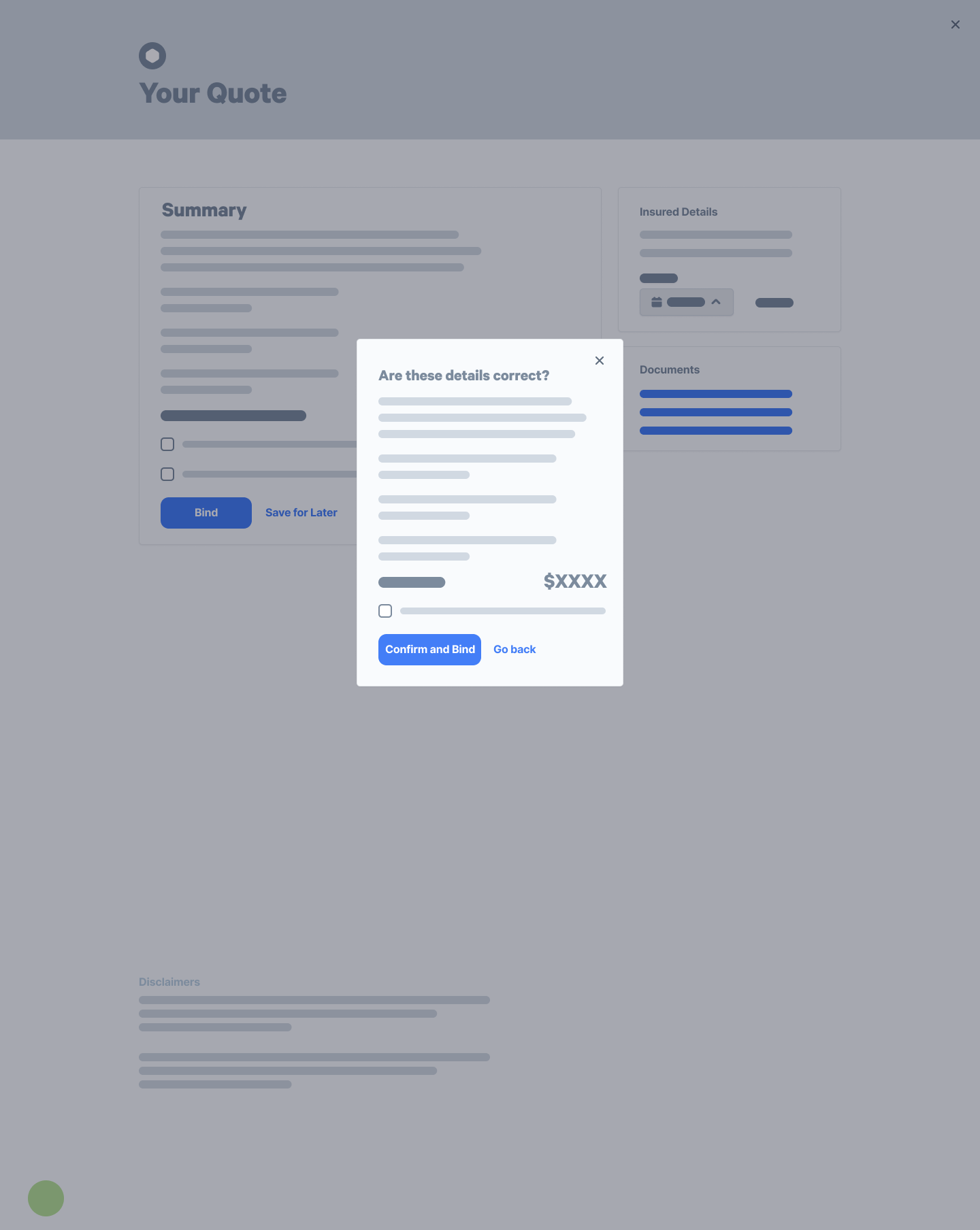
Fully Eligiblepartially declinedpartially referredreferredBy combining clear UX writing with segmented sections, we improved how users understood the status of their insurance applications. This structure created an organized view where progress could be tracked at a glance.
Using direct, plain language in each section ensured users knew exactly where they stood - whether their application was under review, approved, or required additional action. This approach not only streamlined the experience but also built trust, giving users a transparent and easy way to follow each stage of their application.
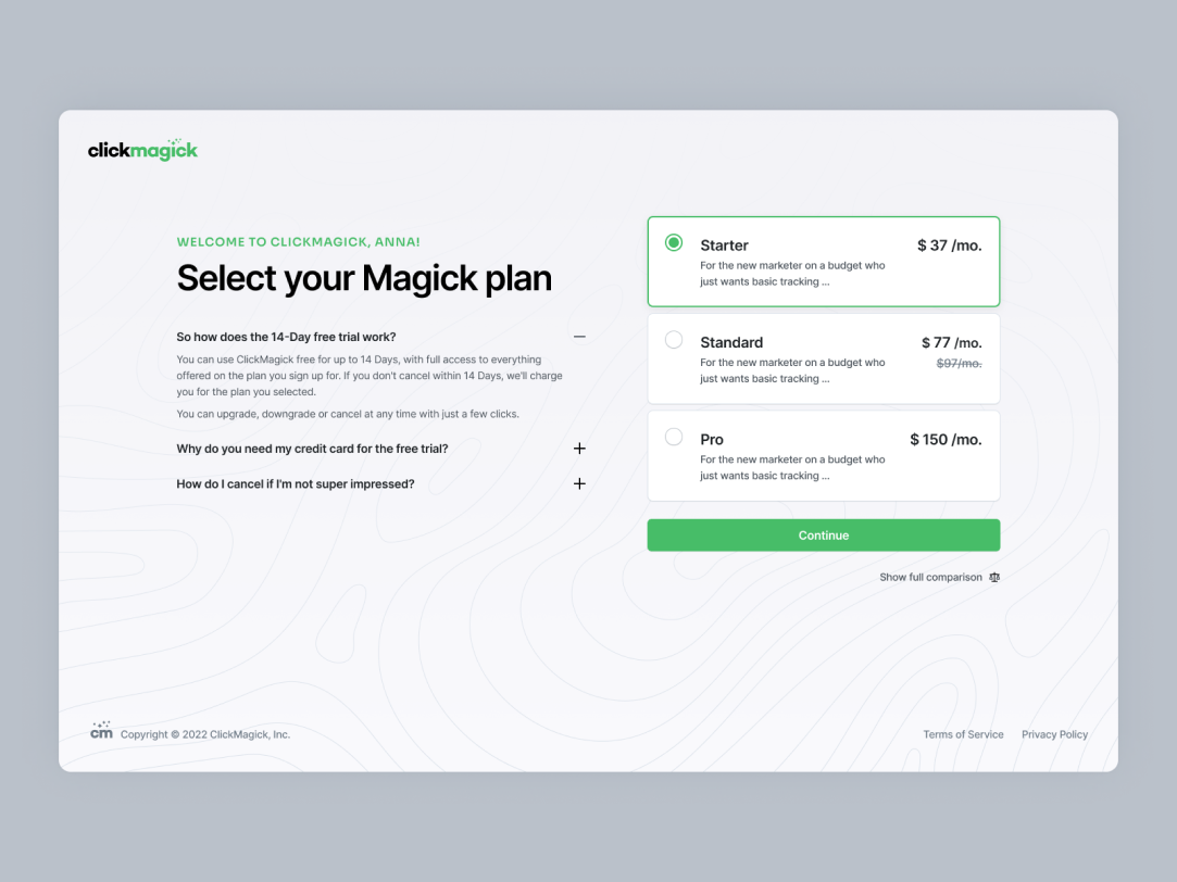
Modernizing the UI by bridging toward a shopping-like experience
To push modernization further, we set out to make the quoting interface feel more like an online shopping journey: something users already know and trust. One major focus was on pricing transparency. In the old model, taxes and fees were hidden away on a separate summary page, leaving users uncertain until later in the process. Even though at the time resource limitations constrained our ability to fully implement these upgrades, we redesigned the flow to surface this information right alongside the premium (similar to how e-commerce sites clearly display item prices and additional costs up front).
This wouldn’t be just a visual update. It was about clarity, trust, and reducing surprises. By showing all costs early, users could better understand their quotes and feel more confident in the process.
The work extended across the whole project. We created personas to capture the needs of small business owners, developed flowcharts and wireframes with cross-functional teams, and validated ideas through stakeholder and user feedback. While resource limitations kept us from fully realizing every upgrade, the team still delivered a meaningful shift: quoting that feels more intuitive, transparent, and aligned with everyday digital experiences.
The result was a redesign that not only modernized the interface but also made digital insurance quoting feel familiar, straightforward, and user-friendly.