
Here’s how I helped
Self-served certificates
We increased the percentage of self-served certificates to 93% within the first 4 weeks

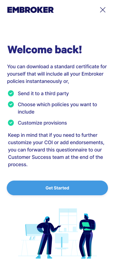
Certificates of insurance act as proof that a person or business has active coverage. They’re an important way to build credibility while also protecting against legal or financial risk. For partners, clients, or venues, these certificates provide assurance that you’re prepared for unexpected events, whether that’s property damage, bodily injury, or other industry-specific risks.
Feedback we got from our SMEs
“One common difficulty customers encounter during the onboarding process is requesting a Certificate of Insurance (COI) with specific details. They often have trouble customizing the COI according to their needs.”

“A lot of folks are mainly after that COI. They just want to tick off those insurance boxes so they can get back to what really matters to them – building their products and keeping their business rolling.”

Understanding the problem
In working with the SME and Customer Success team, it became clear that Embroker users wanted a simple, stress-free way to get their Certificate of Insurance (COI). Entrepreneurs preferred to focus on running their business, not wrestling with complicated insurance steps. My task was to design an accessible, straightforward system that delivered clarity and reassurance at every stage.
Through user research, I identified where guidance was most needed and refined the flow to feel supportive without being intrusive. The goal was to make the process efficient and user-friendly, helping users quickly obtain their COI and get back to what matters most: growing their business.
What made our previous flow ineffective?
Clients had trouble locating the information they needed.
Lack of clear guidance left them unsure if they were completing steps correctly.
The overall process felt overwhelming and confusing, creating unnecessary frustration.
Designing the journey map: Charting the user experience path
Together with the product owners, we created a journey map to capture the full COI experience from start to finish: researching, requesting, configuring, receiving/downloading, and post-receiving. At each stage, we mapped what users were doing, thinking, and feeling, while also identifying key touchpoints and opportunities to improve.
One of the most important insights was that users experienced anxiety at multiple points in the process. Reducing this sense of uncertainty became a core design goal - helping us shape a smoother, more reassuring experience overall.
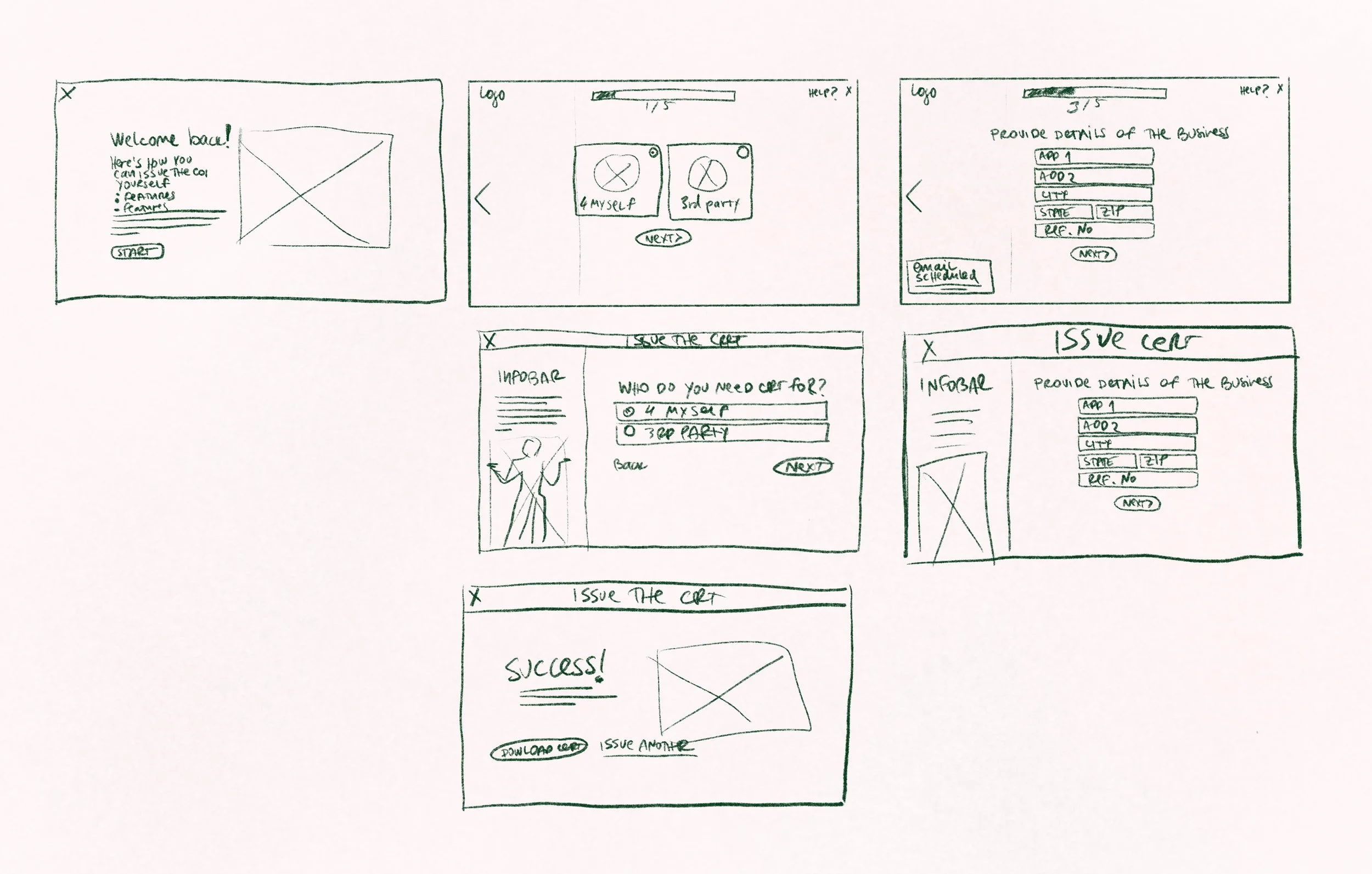
Developing a flowchart: visualizing the process steps
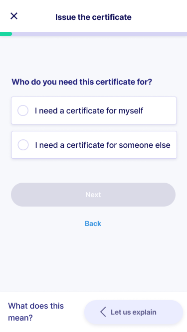
When mapping out the Certificate of Insurance (COI) flow, a key fork in the journey became clear: some users issued a COI for their own records, while others needed to send it to a third party. This distinction helped highlight two very different intents, each with its own needs and expectations.
By visualizing these paths and their decision points, I could better design an experience that accounted for both scenarios, ensuring the process felt relevant, efficient, and supportive no matter the user’s goal.
Ideation phase: developing early wireframes and designs rooted in UX laws and psychology
n the ideation phase, I built early wireframes guided by core UX laws and psychological principles, with the goal of making a complex process feel simple and approachable. Using Fitts’s Law, I designed interactions that made navigation and task completion easier and more efficient. With Miller’s Law in mind, I structured information in digestible chunks to reduce cognitive load and keep users from feeling overwhelmed.
I applied progressive disclosure to reveal details step by step, keeping engagement high without flooding users with information all at once. To leave a strong impression, I leaned on the Peak-End Rule, ensuring that the most important and rewarding parts of the journey stood out both during and at the end of the experience.
These choices shaped wireframes that weren’t just visually clear, but also aligned with how people think, act, and process information—resulting in an experience that felt intuitive, balanced, and human-centered.

Minimize Task Perception
The first thing users do when they see a new form is estimating how much time is required to complete it.¹
Separating fields in different steps eases the user’s perception of how hard it is to complete, making the whole process look easy.
1. Smashing Magazine, What makes an effective form (2008)
Fitt’s Law
The time to acquire a target is a function of the distance to and size of the target. ²
2. Fitt’s Law: The importance of size and distance in UI Design (2019, June 5), The Interaction Design Foundation
Miller’s Law
The point where confusion creates an incorrect judgement is the capacity of our memory. The span of immediate memory and absolute judgement is limited to around 7 pieces of information.³
3. Miller, G. A. (1956), “The magical number seven, plus or minus 2. Some limits on our capacity for processing information”
Progressive Disclosure
Encouraging users to move from completing simple actions to executing more complex ones lowers the chances that users will feel overwhelmed.⁴
4. Prototypr.io, Designing for Progressive Disclosure (2019)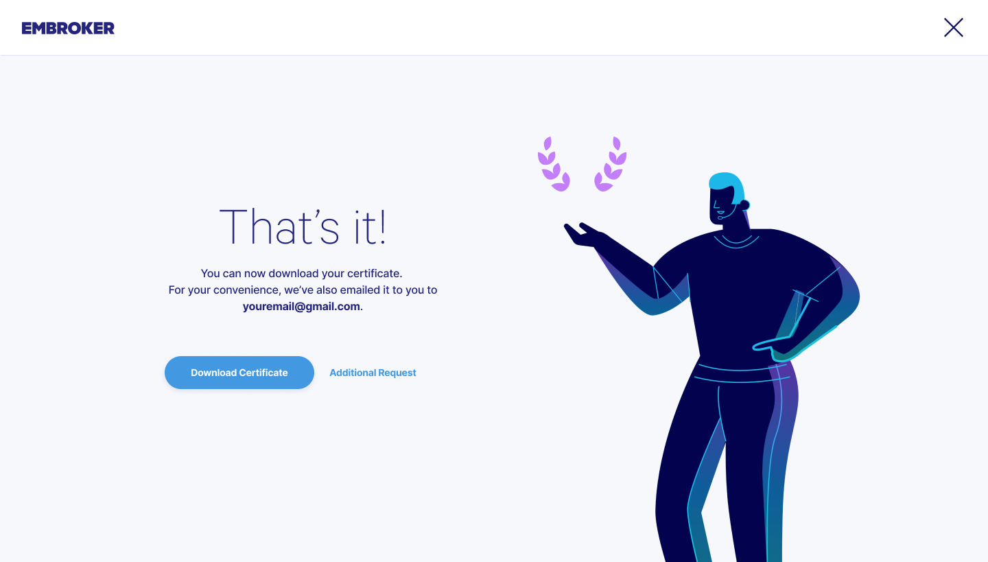
Peak-End Rule
Your brain heavily weighs the peaks and the end of an experience.⁵
5. Peak-End Rule, Psychology of Design (2021)User testing: comparing two options with varying levels of guidance
Using Maze, I conducted monitored user testing on two different flows, each offering a unique level of guidance.
The first flow took a minimal approach: users were guided one step at a time, with optional tooltips available on hover to provide context and support when needed. This design kept the interface clean and focused, encouraging concentration on the task at hand.
The second flow introduced an information bar on the left side of the screen. This bar explained each step, clarified why specific details were required, and helped break down insurance terminology. The goal was to actively educate users and give them greater confidence as they moved through the process.
By testing both approaches, we were able to measure engagement, clarity, and comprehension, helping us determine which flow best supported a smooth and informed user experience.
We interviewed 16 participants to evaluate the two user flows, then asked them to complete a questionnaire at the end of testing. The results showed a clear preference for the second flow: the version with the information bar.
Confidence ratings highlighted the difference. In the minimal flow with tooltips, participants rated their confidence at an average of 8.7. In the second flow with the infobar, that number climbed to 9.3. The added context and explanations helped users feel more informed and supported, boosting their comfort with making decisions throughout the process.
This higher confidence score, along with other favorable feedback, reinforced that the infobar design created a more transparent, reassuring, and effective user experience.
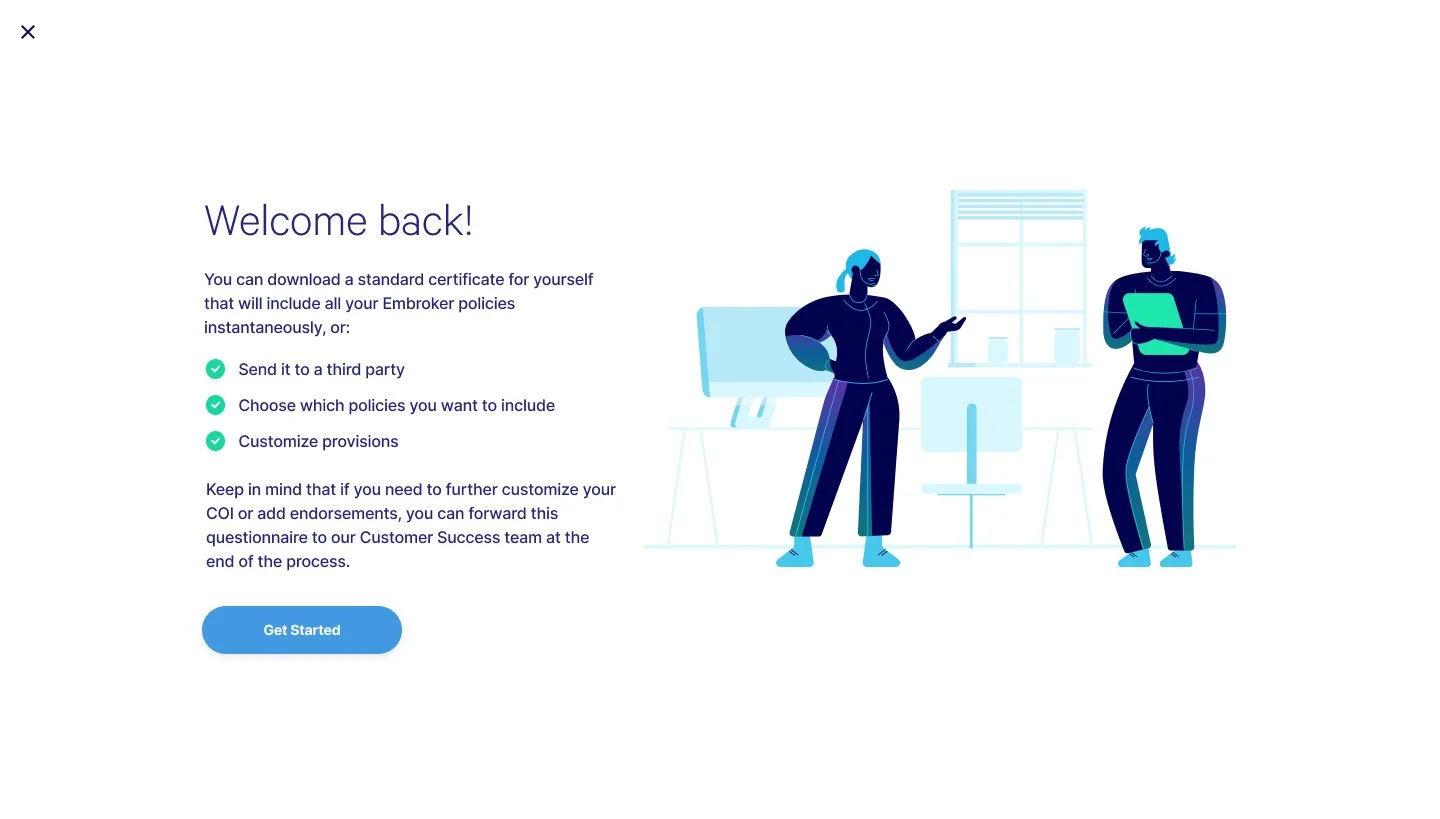
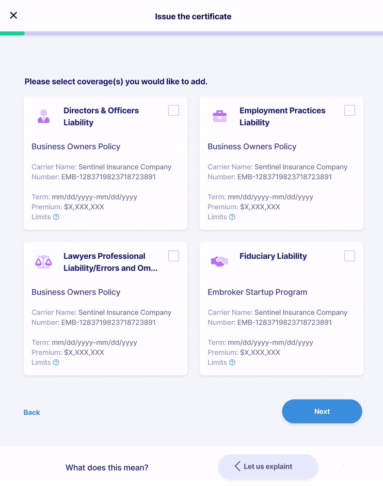
Final designs: refining and implementing user feedback
In the final stage, I focused on delivering responsive designs that worked seamlessly across mobile, tablet, and desktop, while staying true to our existing design system. Although I had explored ideas for expanding the system earlier, I ultimately needed to adapt within its limits, setting aside enhancements like larger radio button cards and a progress bar with clearly defined steps.
Collaboration was key. I partnered with Product Owners and our Copywriter to shape the infobar content, making sure it gave users the reassurance they needed when self-issuing certificates. I also integrated illustrations aligned with the style of our marketing site, ensuring a cohesive visual language across touchpoints.
Even with some ideas left on the table, the final design struck the right balance of functionality, visual appeal, and user confidence, delivering an experience that felt polished, consistent, and supportive.
Design for desktop


Design for smaller screens

1024
“Banner blindness is an instance of selective attention: people direct their attention only to a subset of the stimuli in the environment — usually those related to their goals. This behavior is a consequence of our limited attention capacities.”
NN Group article "Banner Blindness Revisited: Users Dodge Ads on Mobile and Desktop"860776Design for mobile

New feature announcement


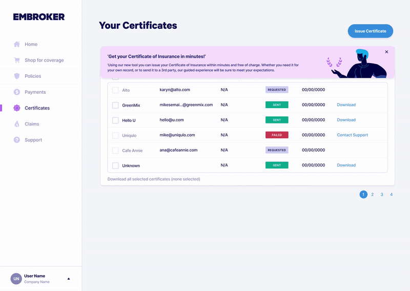
When announcing the new feature, I drew on NN Group research about banner blindness to make sure users actually noticed and engaged with it. Instead of relying on a traditional banner that could be easily overlooked, I designed the announcement to partially obstruct the UI, making it impossible to miss.
To further capture attention, I added a subtle floating animation. This slight movement set it apart from the static elements of the interface, creating just enough contrast to draw the eye without being distracting.
By breaking from convention in both placement and behavior, the announcement stood out immediately, ensuring users saw it, engaged with it, and were motivated to explore the new feature.
Post-release results: analyzing the impact of the new feature
The first week after release showed immediate impact: of 123 certificates requested, 94% (115 certificates) were issued through the new self-service flow.
Analytics confirmed this wasn’t a one-time spike. Over the following four weeks, the trend held steady—most users consistently chose self-service to issue their certificates. This sustained behavior demonstrated strong adoption, validating the flow as both effective and widely accepted by users.