EMBROKER · FINTECH / INSURANCE · SHIPPED PRODUCTIncreasing multi-product insurance adoption
I redesigned Embroker’s multi-product quoting experience to help customers evaluate additional coverage, understand different product states, and move through a more complex insurance application with greater confidence.
The project in 20 seconds
Embroker is a digital insurance platform offering businesses multiple types of commercial coverage through one online experience.
Customers often arrived looking for one product, even when additional coverage could be relevant. Every added product brought more value—but also more decisions, rules, and application complexity.
Increase multi-product adoption without making coverage decisions or the application harder to understand.
Product framing and journey design through prototyping, testing, delivery, and post-launch optimization.
Law bundle submission rate increased from ~56% to ~64% after post-launch iteration.
Project details
Embroker
Digital business insurance platform
Multi-product quoting and application
Product / UX Designer
Existing product expansion and workflow redesign
Shipped + post-launch iteration
Product growth · Coverage selection · Complex forms · Conversion
2023
The problem
More coverage meant more value, and more decisions.
Businesses often need several types of insurance, but customers may arrive looking for only one.
The opportunity was to introduce relevant additional coverage without turning an already complex insurance decision into an upsell funnel.
Each added product also introduced unfamiliar terminology, different eligibility rules, pricing behavior, and potentially another application.
The design challenge: how could we increase adoption without increasing complexity faster than customer value?
When should customers discover additional coverage?
How much context do they need to decide if it is relevant?
How do we preserve momentum once multiple applications are involved?
Process
From planning to MVP in four months
The work moved through two rounds of divergence and convergence: first to understand the product and journey problem, then to explore and test the solution.
After launch, real customer behavior became the next input for iteration.
Mapping the complexity
One quote flow was coordinating several systems at once.
What looked like one customer journey was actually a coordination problem across coverage selection, product-specific applications, eligibility and referral states, pricing, quote outcomes, and backend constraints.
I mapped those dependencies so we could judge decisions across the whole journey rather than optimizing one screen at a time.
The tension: customer decision-making ↔ insurance rules ↔ pricing ↔ backend constraints.
A decision that simplified one moment could create complexity somewhere else.
initial flowRevised flowHelping users evaluate bundled coverage
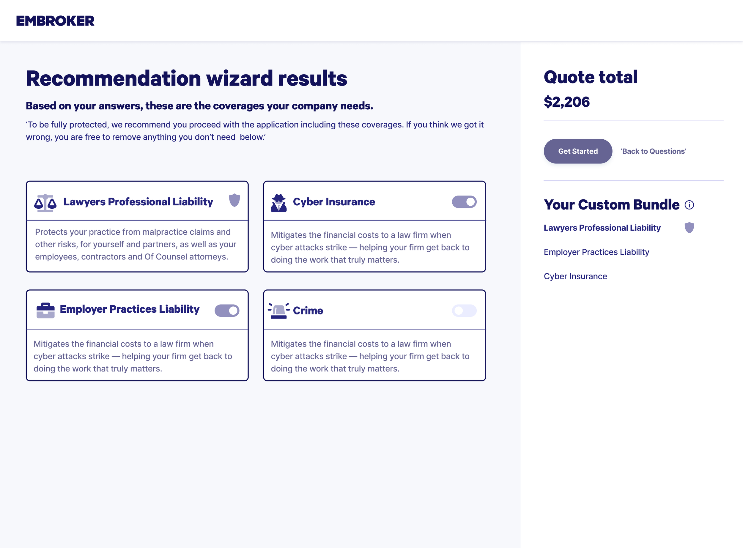
Additional coverage needed to feel relevant, not pushed.
Customers needed enough context to understand why a product might matter, what it covered, and what adding it meant for the journey, without interrupting their momentum.
Early exploration focused on where recommendations should appear and how much explanation customers needed before deciding.
Early exploration focused on where additional coverage should appear and how much explanation customers needed before deciding.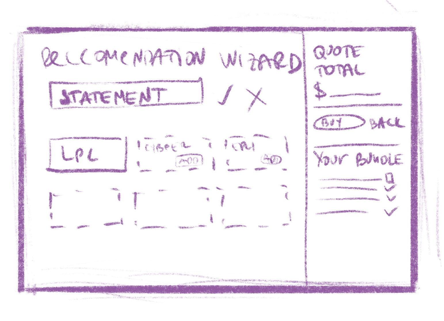
Testing: what we learned
A note on the visuals: we were redesigning the product and evolving the design system at the same time. Unmoderated Useberry testing ran on the existing experience using the old design system. The screens shown in this case study represent the proposed new design system; the behavioral findings below came from the older UI.
Testing showed us where information actually helped.
We used unmoderated Useberry tests with heatmaps to understand where customers clicked, where they hesitated, and what content they largely ignored


|
Area |
What we learned |
|---|---|
|
Quote-estimate questions |
Customers understood the questions, but the path to the estimate felt click-heavy. |
|
Coverage selection |
The overall structure worked, but some products needed more context. |
|
Benefits banner |
A prominent explanation of additional coverage was largely ignored. |
Onboarding
Guidance at the moment of decision
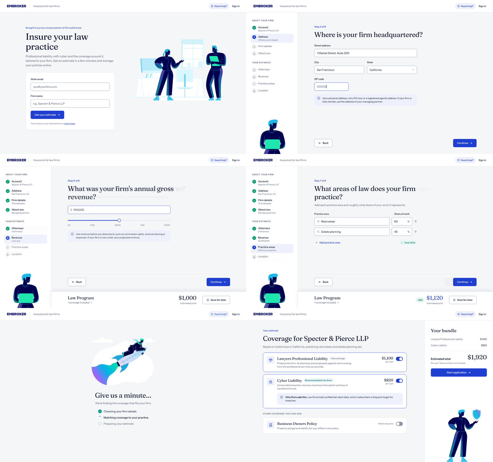
Instead of relying on a separate banner to explain the value of additional coverage, I moved relevant information closer to the choices it supported.
The redesigned onboarding combined account setup and law-firm questions into one guided flow, with one question per step and visible progress toward the estimate.
Quote states across products
One bundle could contain several different outcomes.
Once products could be at different stages at the same time, one bundle-level status was no longer enough.
I moved status to the product level so customers could immediately see which coverage was ready, declined, or waiting for review, and what they could do next.
|
State |
What the customer sees |
What they can do |
|---|---|---|
|
Fully eligible |
Every product Ready to bind, with its price |
Review and bind |
|
Partially declined |
Ready products, plus the declined one grouped as Not available |
Bind the ready products |
|
Partially referred |
Ready products, plus a Needs review group and an estimated total range |
Submit for review only |
|
Referred |
An estimated range for the referred product |
Submit for review only |
Before and after
How the redesign improved the experience as a whole
Side by side, the old quote and the new one show what changed across the whole journey, not just on one screen.
BeforeAfterDesign system
Building the flow from reusable foundations
The redesign used a small set of shared foundations and components, allowing additional products to reuse the same structure rather than introducing new one-off patterns.
Impact
Launched in 4 months
From big-room planning to MVP release
Under 1 → over 1.4 policies per customer
Policies per customer in the law vertical increased within 6 months
+17% application submissions
After removing the “Before you begin” screen
~56% → ~64% law bundle submission rate
After removing persistent dynamic pricing from the application flow
After launch
Real behavior changed the product again.
The MVP launched four months after planning as a two-product offer for law firms.
By July, policies per customer in the law vertical had grown from under 1 in January to more than 1.4. Zero-touch producer interactions per customer also increased from 47.5% in Q3 2022 to 51% in Q1 2023.
Later iterations addressed friction we could only see once real customers were using the product and extended the structure to two more products.
+17%
More submitted applications
after removing the “Before you begin” screen.
Before
After
Submissions indexed to 100 before the change.
56% → 64%
Law bundle submission rate
after removing persistent pricing from the application flow.
Before
After
Approximate rates, law bundle applications.
1.4+
Policies per customer
within 6 months of launch, up from under one.
Before
6 months
Before is shown at 1.0 as an upper bound; the actual figure was under one.
Post-launch optimization
Launch showed us what prototypes couldn’t.
Real behavior under real product conditions gave us much stronger signals than the first release could. Those signals drove two targeted changes.
Iteration 1: Reassurance became friction
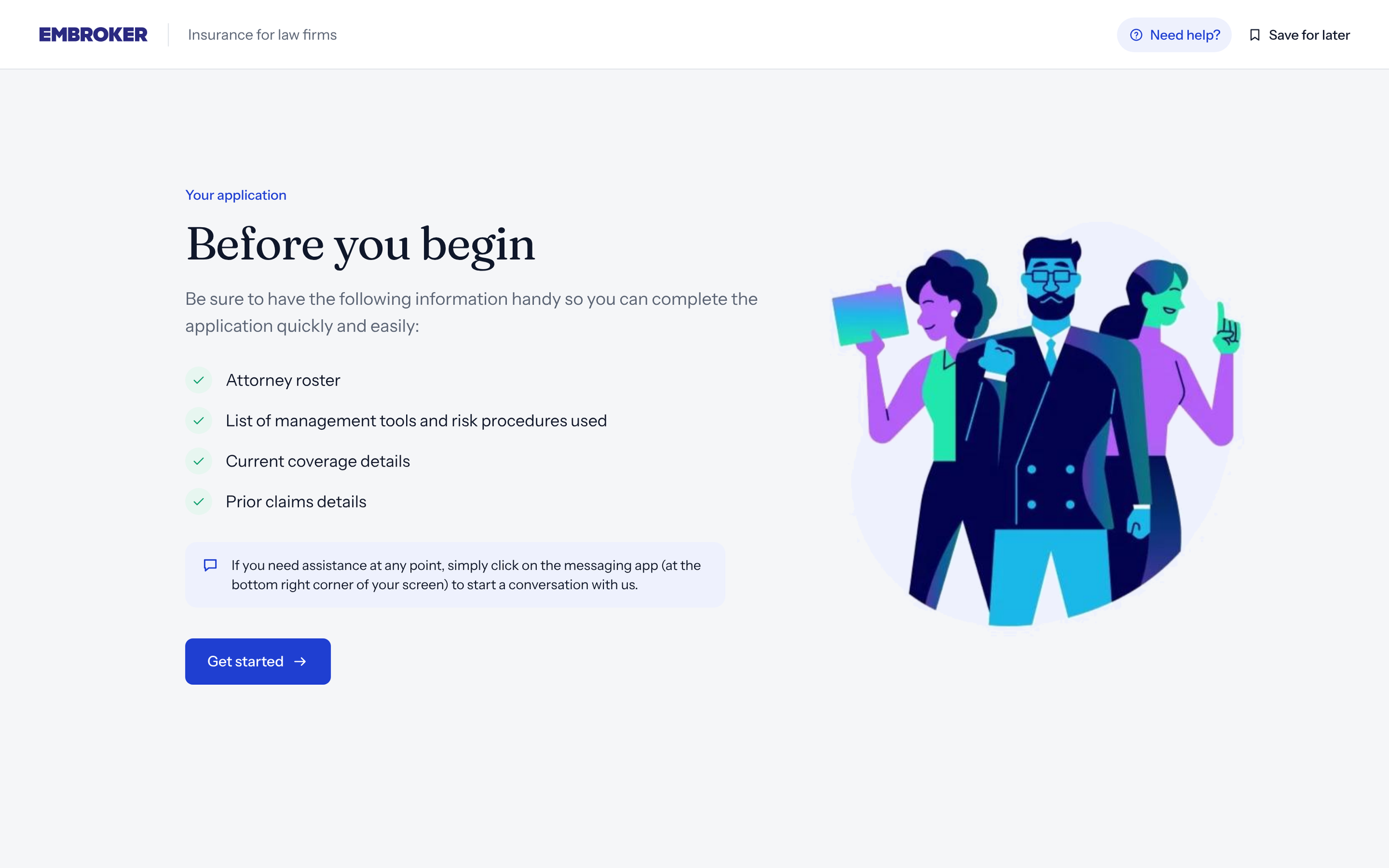
What we saw: Customers were dropping before they reached the application.
What changed: We removed the standalone “Before you begin” step and moved essential guidance into the application itself.
Result: +17% application submissions
What it taught us: Reassurance becomes friction when it appears before users need it.
Iteration 2: Pricing at the right moment
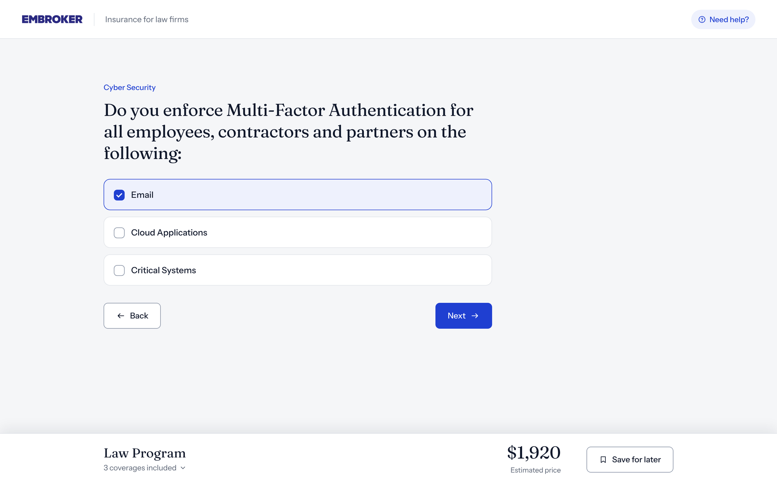
What we saw: Customers completed more often when pricing was not visible throughout the flow.
What changed: We removed the fluctuating persistent price and showed the estimate where price actually supported a decision.
Result: Law bundle submission rate ~56% → ~64%
What it taught us: Transparency still mattered. Timing mattered more.
What the final experience optimized for
|
Principle |
Final direction |
|---|---|
|
Coverage decisions |
Enough context to evaluate additional coverage without feeling pushed. |
|
Momentum |
No front-loaded explanation before customers were ready for it. |
|
Product-level clarity |
Every product communicates its own outcome and next step. |
|
Implementation-safe logic |
Supports real eligibility, start-date, charging, and backend constraints. |
|
Pricing |
Visible when it helps a decision, not persistently fluctuating. |
|
Scalability |
The same structure later expanded to two more products. |
Reflection
Designing for trust does not mean showing people everything upfront.
In insurance, it is tempting to explain every requirement, price change, eligibility detail, and edge case before customers move forward. Real behavior showed that information at the wrong moment could make the experience feel heavier rather than safer.
The strongest improvements came from removing unnecessary friction, making complex outcomes clearer, and continuing to refine the experience after launch.
The goal wasn’t to make insurance simple.
It was to make each decision clearer at the moment it needed to be made.
Next project →Rebuilding Micetro’s design foundation for WCAG AA readiness
Bringing a legacy enterprise interface closer to BlueCat’s design system while improving accessibility and implementation quality.