AI-ASSISTED PRODUCT EXPLORATIONSWorking prototypes, and the decisions inside them
I use AI to move quickly from a messy idea to something I can test, question, and refine.
Each experiment starts with a product problem. I define the interaction model, work through the logic and edge cases, and use AI to accelerate prototyping, content exploration, and iteration.
These are self-directed concepts rather than shipped client work. AI speeds up the making; I remain responsible for the product decisions.
Featured experiments
Three explorations into money, uncertainty, and human–AI interaction.

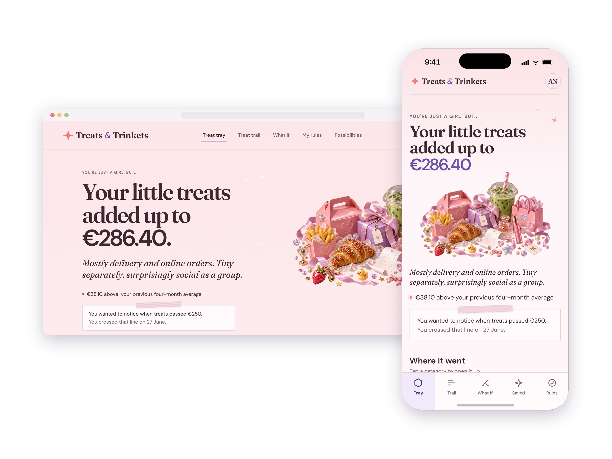
Treats & Trinkets
How can a spending tool reveal patterns without making people feel judged?
A cross-platform money experiment small purchases, cumulative behavior, and reflection without guilt-driven budgeting.
MONEY · CROSS-PLATFORM UX · AI-ASSISTED PROTOTYPING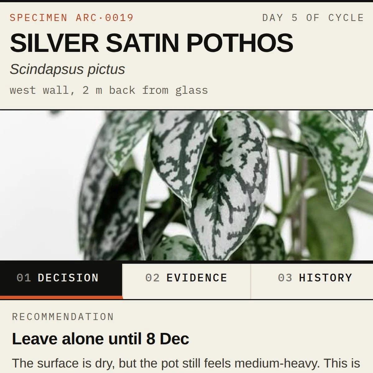
Watering Horizon
How should a decision-support system behave when its data is incomplete?
An operational tool exploring recommendations, confidence, timelines, and explainability when the system cannot know everything.
DECISION SUPPORT · COMPLEX UX · UNCERTAINTY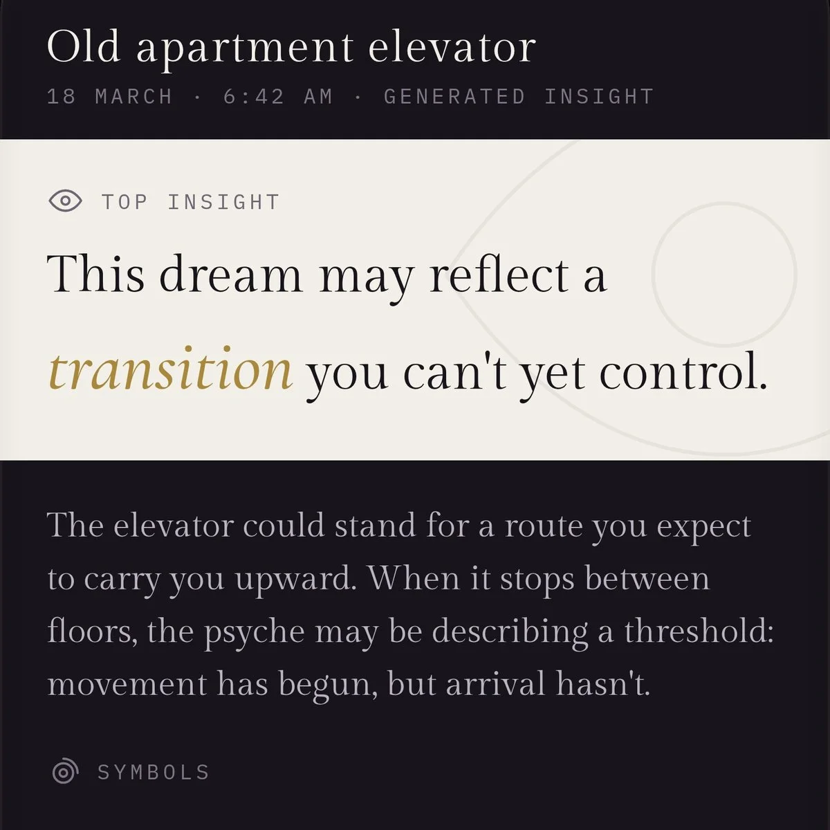
Dream Thread
How can AI support reflection without pretending to know the answer?
An AI-native concept exploring interpretation, context, ambiguity, and the boundary between useful guidance and false certainty.
AI INTERACTION · MOBILE UX · HUMAN–AI BOUNDARIESMONEY · CROSS-PLATFORM UXTreats & Trinkets
Making spending patterns visible without turning reflection into punishment.
Small purchases rarely feel important on their own. A coffee, delivery fee, or impulse buy can be easy to dismiss in the moment, even when the pattern becomes meaningful over time.
I explored a money product that makes those patterns easier to see while avoiding the guilt, restriction, and “good versus bad” language common in budgeting tools.
Three decisions shaped the concept
01 Separate capture from reflection
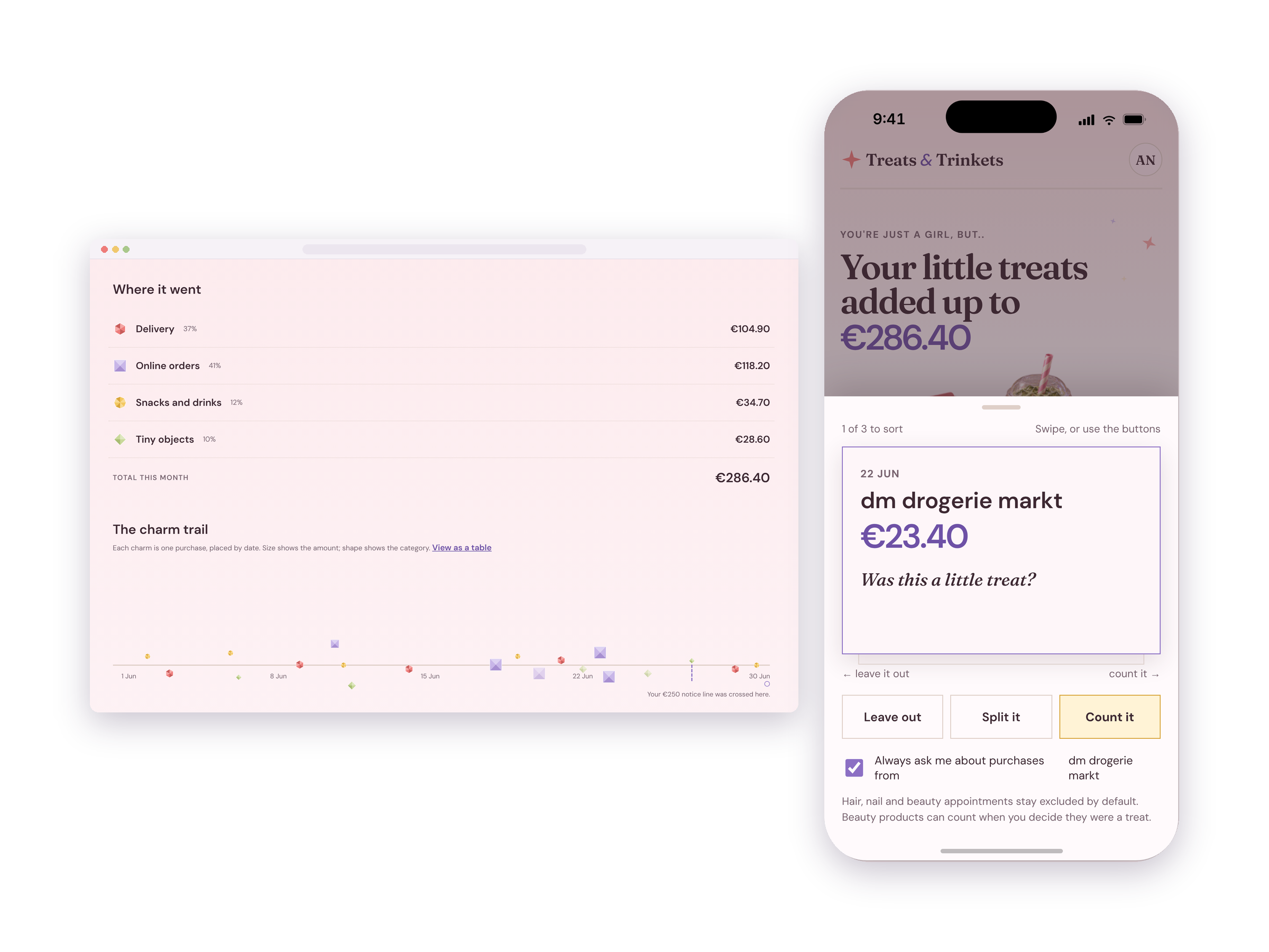
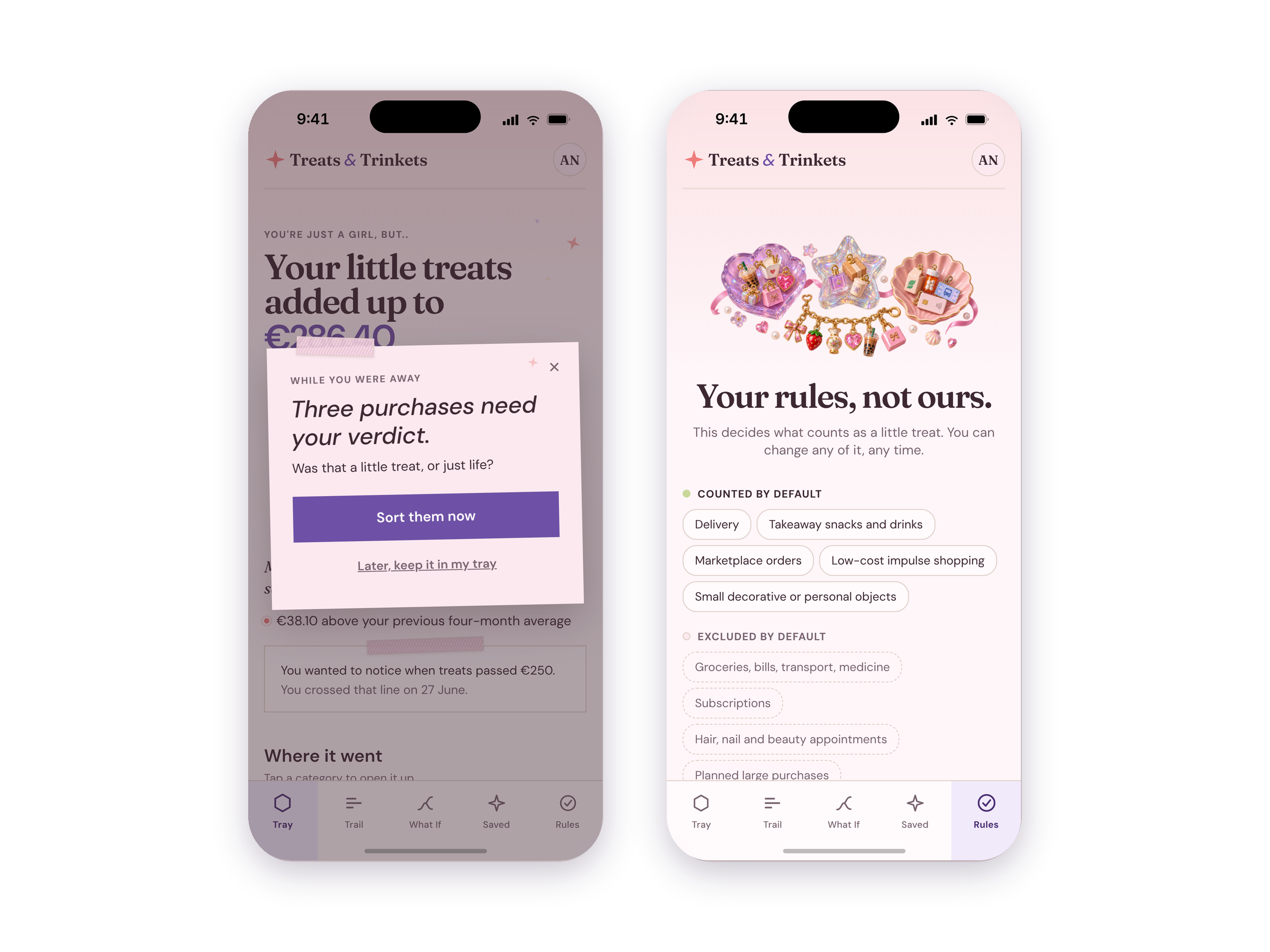
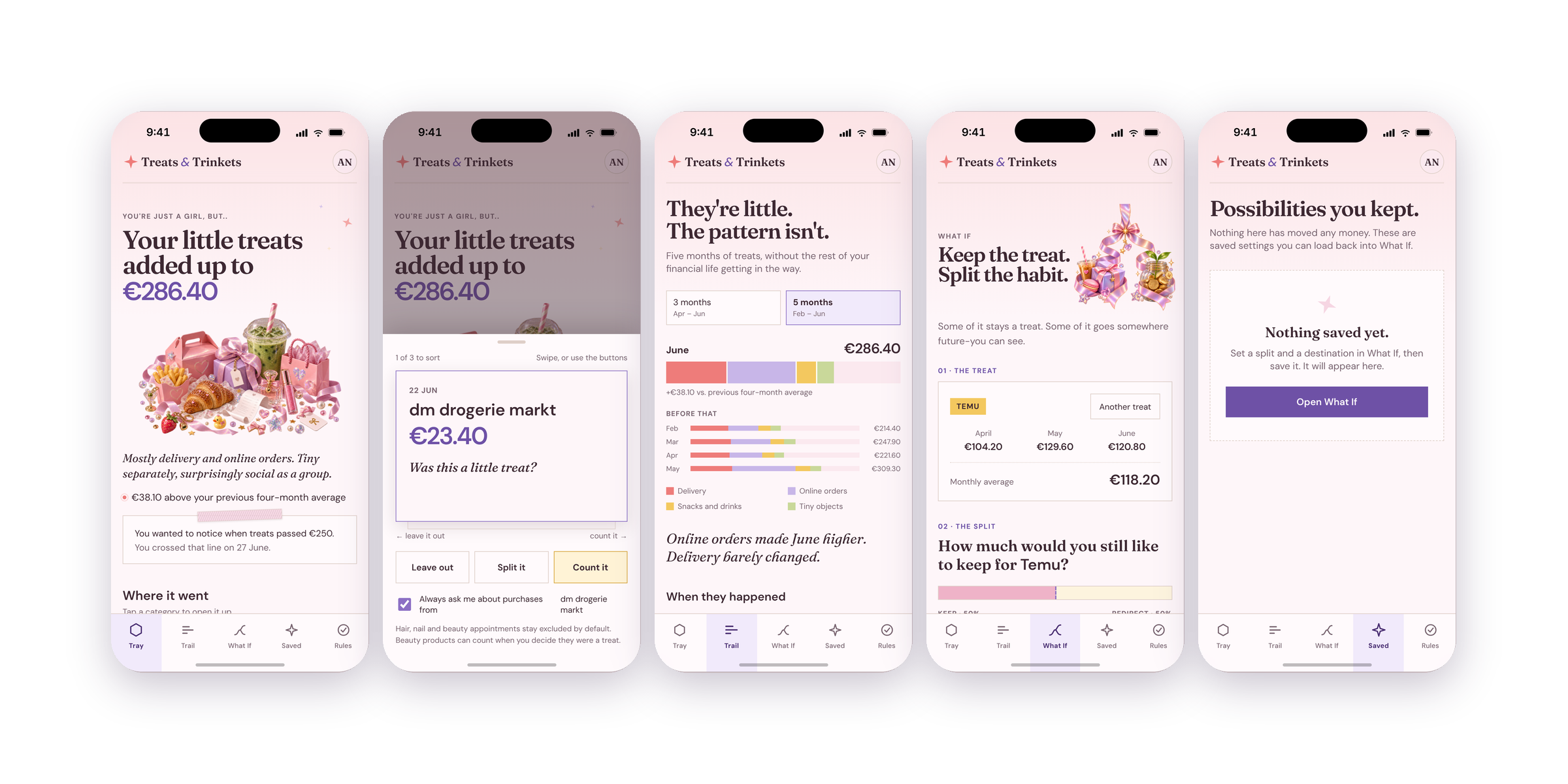
The mobile experience is designed for the moment: record a purchase, make a quick decision about it, and move on.
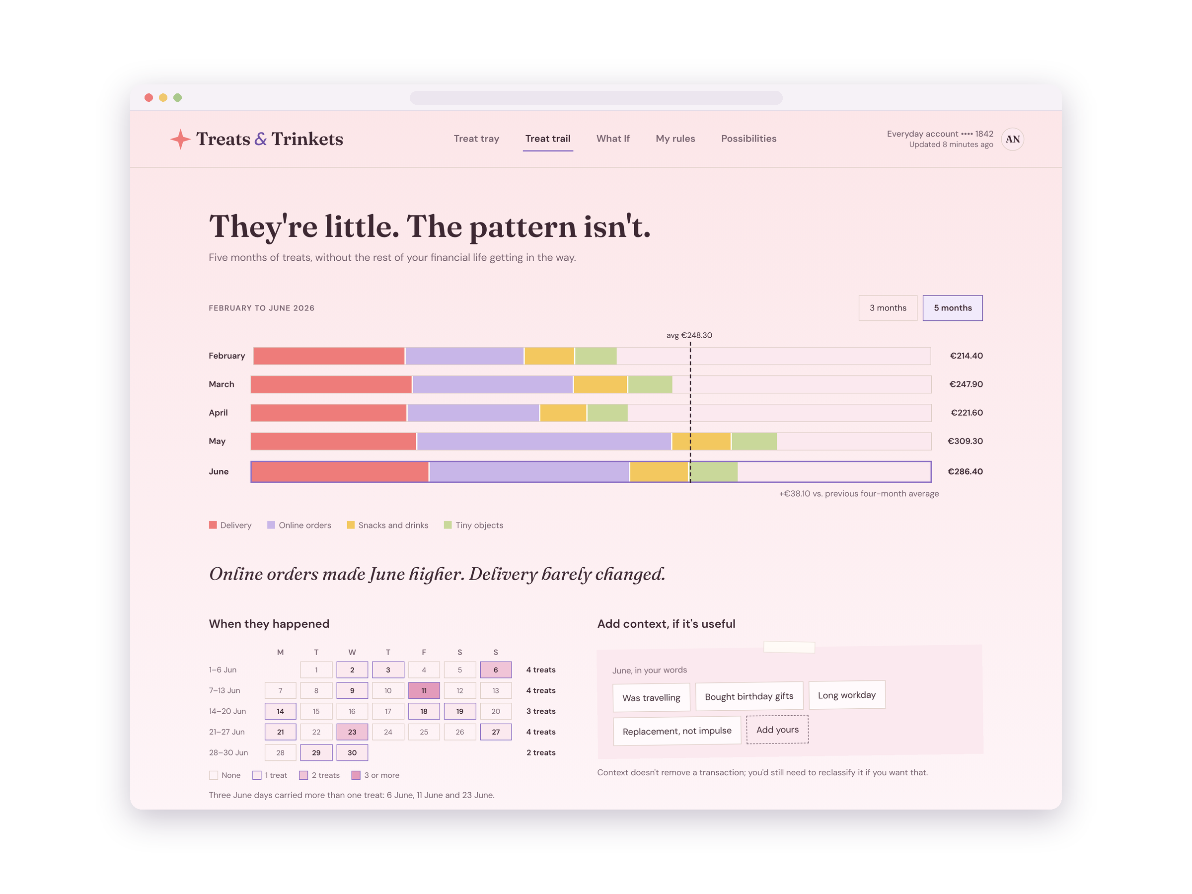
The desktop experience gives the pattern more room. Instead of repeating the mobile interface at a larger size, it supports comparison, review, and reflection across a longer period.
The same product serves two different mental modes: immediate action and later sense-making.
02 Ask a more useful question than “Was this bad?”
Traditional budgeting language can turn spending into a moral judgment.
I wanted the interaction to support awareness instead.
Rather than classifying purchases as simply responsible or irresponsible, the concept asks users to consider what the purchase represented: something essential, a deliberate treat, or something they might make differently next time.
The purpose is not to punish the transaction. It is to make the decision more visible.
03 Prioritize patterns over individual purchases
A single €7 purchase rarely tells someone much.
The more useful signal appears across time: how often the same type of spending happens, how much it adds up to, and whether the pattern still feels worthwhile.
The product therefore gives accumulated behavior more weight than individual transactions.
Where AI helped
AI helped me move quickly through prototype construction, sample data, interface states, and content variations.
It did not decide what the product should encourage, how mobile and desktop should differ, or how to make money behavior visible without introducing shame.
Those were product decisions.
Try the working prototypes ↓
Prototype uses synthetic data and does not connect to financial accounts or move real money.DECISION SUPPORT · COMPLEX UXWatering Horizon
Designing useful recommendations when the system cannot know everything.
Plant care gave me a useful sandbox for a broader product problem: many decision-support systems need to recommend an action without having complete information.
Without continuous sensor data, the product cannot truthfully know the exact moment a plant needs water. The more interesting design question became:
How do you make uncertain information actionable without disguising it as certainty?
Three decisions shaped the concept
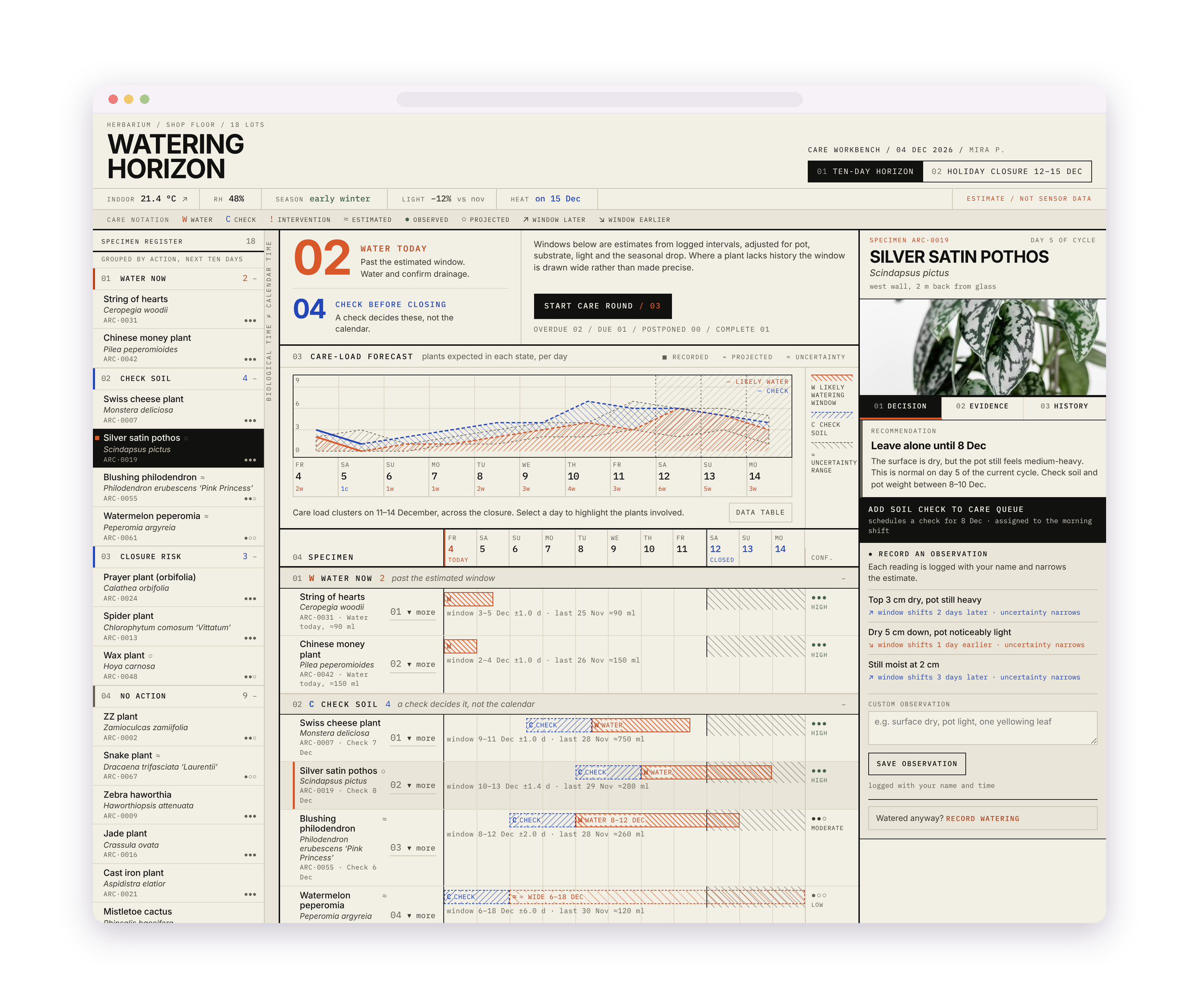
01 Represent uncertainty instead of inventing precision
It would have been easy to give every plant a precise “water on Tuesday” recommendation.
That precision would also be misleading.
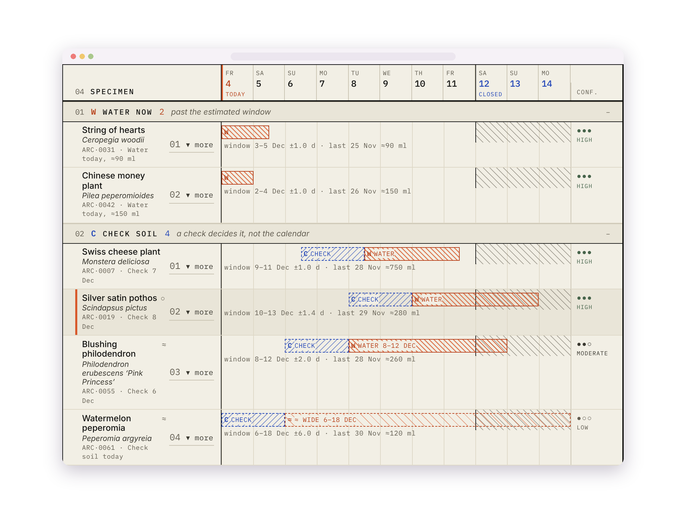
Instead, the concept works with care windows, observed conditions, and confidence. The system can still support a decision without pretending its estimate is a fact.
Useful does not have to mean artificially certain.
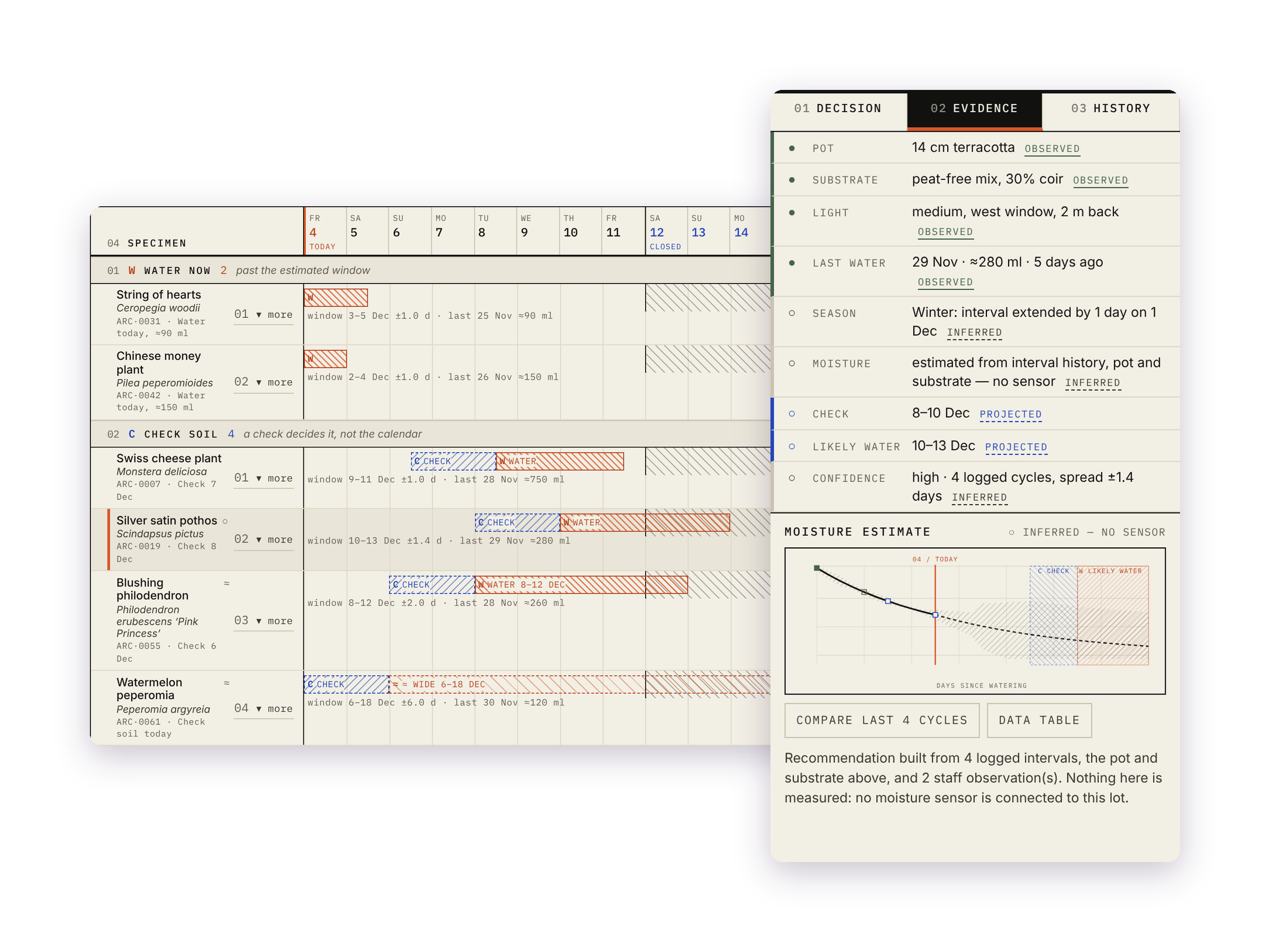
02 Put the reasoning beside the recommendation
A recommendation is more useful when someone can inspect why it changed.
Recent observations, missing logs, previous care, and condition changes sit close to the suggested next action so staff can evaluate the recommendation rather than blindly following it.
That makes the interface less about issuing instructions and more about supporting informed judgment.
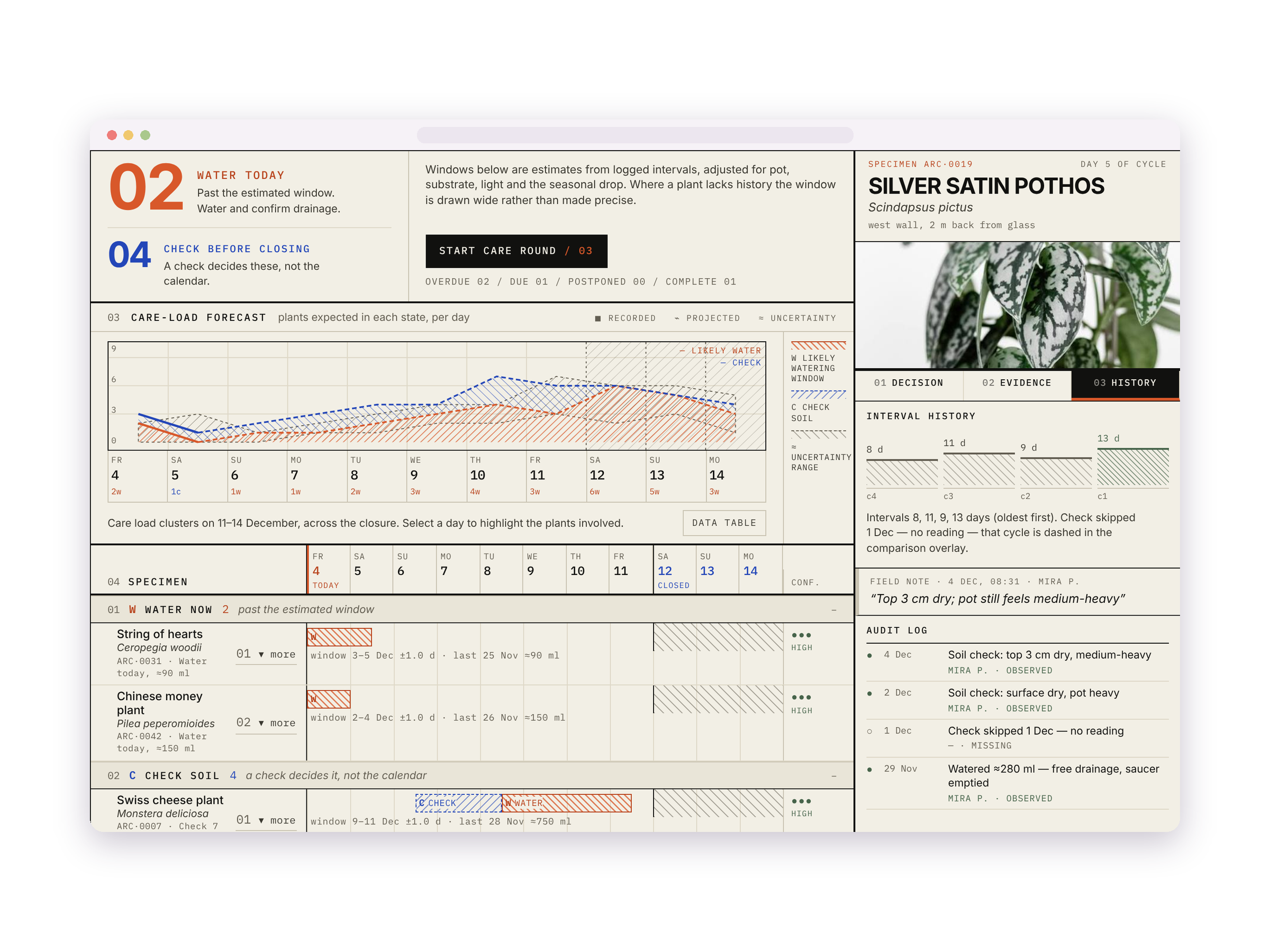
03 Show change over time
A single observation can be misleading.
A timeline gives staff the surrounding context: previous checks, watering events, condition changes, environmental shifts, and interventions.
That makes it easier to distinguish a developing pattern from an isolated anomaly.
Where AI helped
I used AI to accelerate scenario generation, prototype logic, interface states, and sample operational data.
The important design problem was not whether the system could generate a recommendation.
It was whether a person could understand what it was based on, how confident it was, and what to do next.
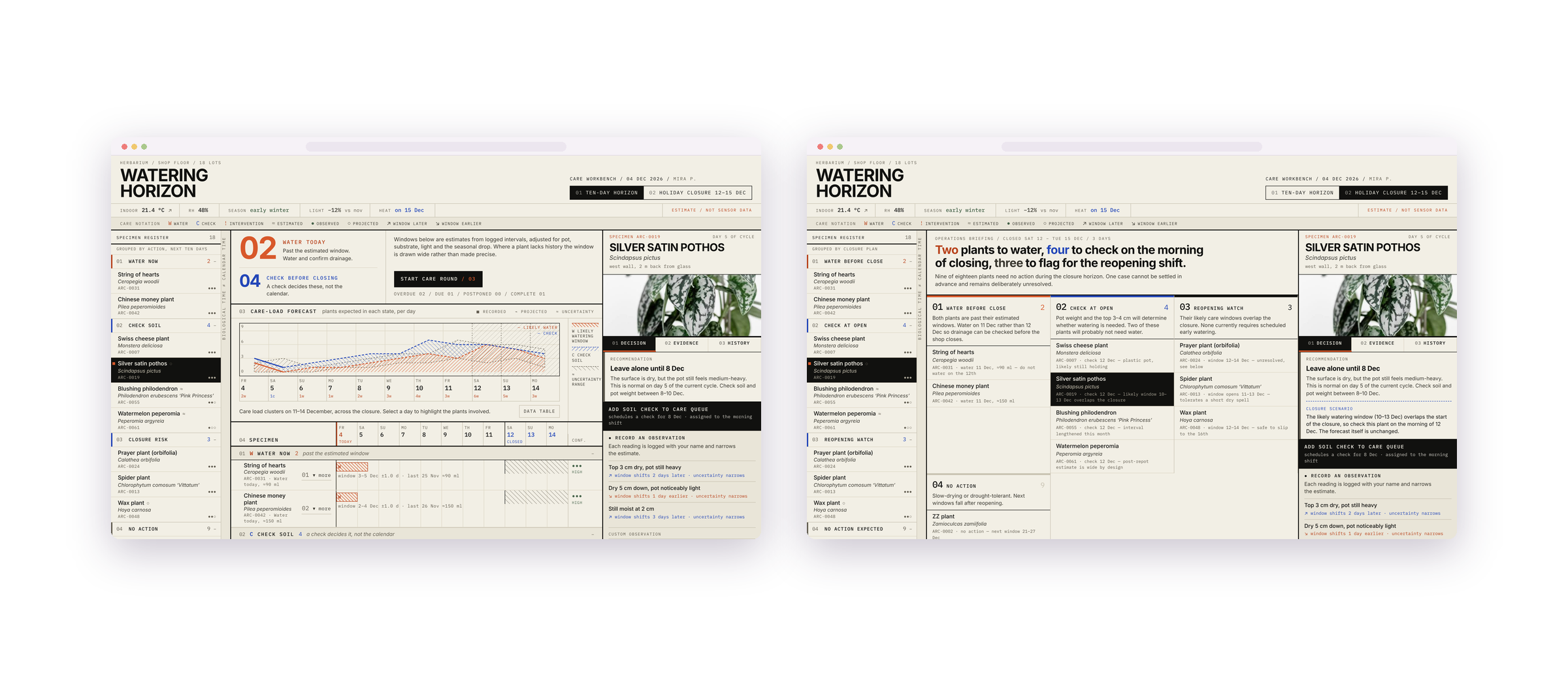
This is a conceptual decision-support prototype. Recommendations and operational data are illustrative.AI INTERACTION · MOBILE UXDream Thread
Supporting reflection without pretending an AI interpretation is the truth.
I began by experimenting with a custom GPT built around a curated set of Jungian texts and instructions.
The limitation appeared quickly. AI could produce interpretations that sounded thoughtful and convincing, but convincing was not the same as true, specific, or useful. That became the real product question:
How could an AI experience support reflection while preserving ambiguity, context, and user agency?
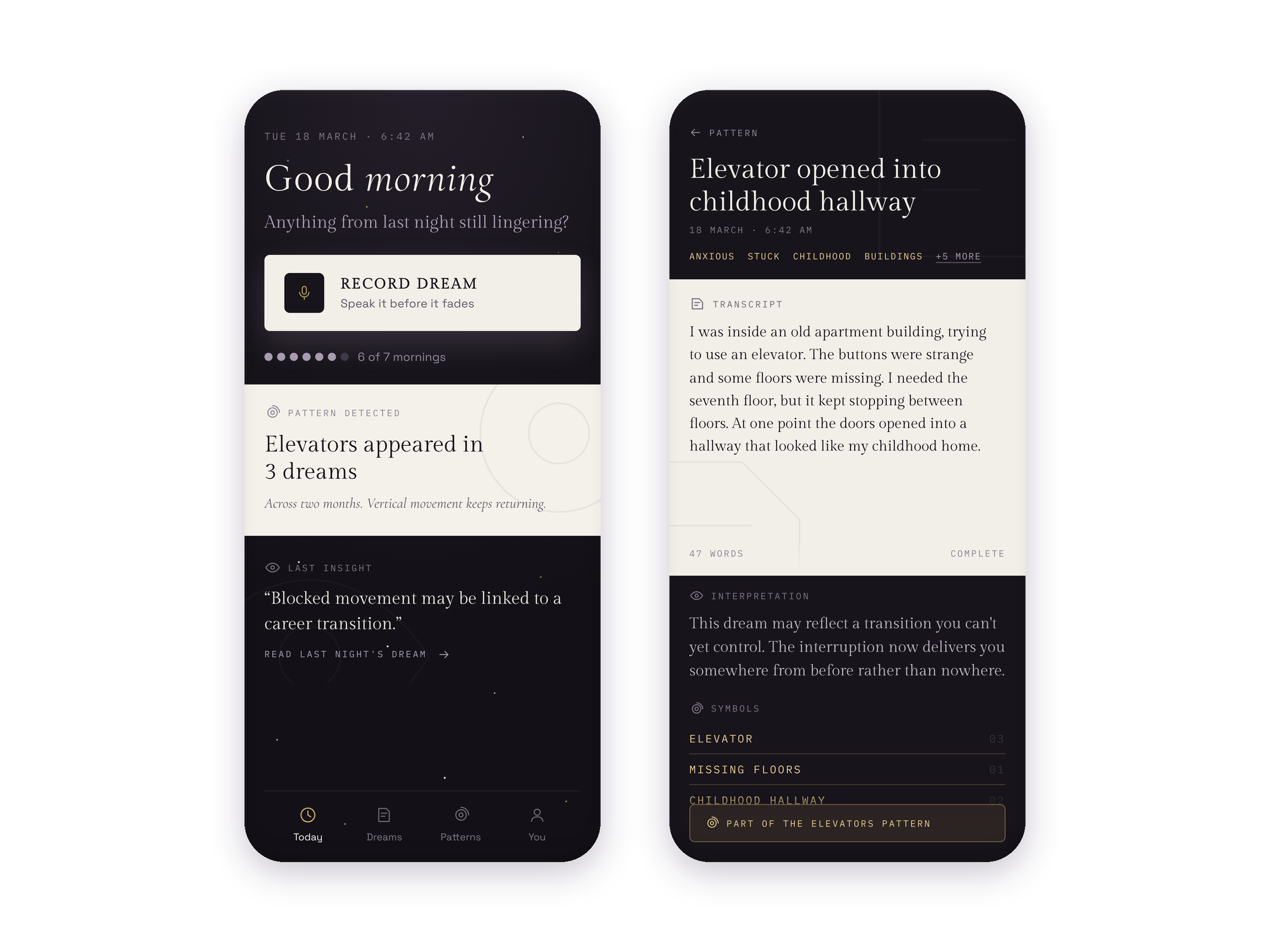
Three decisions shaped the concept
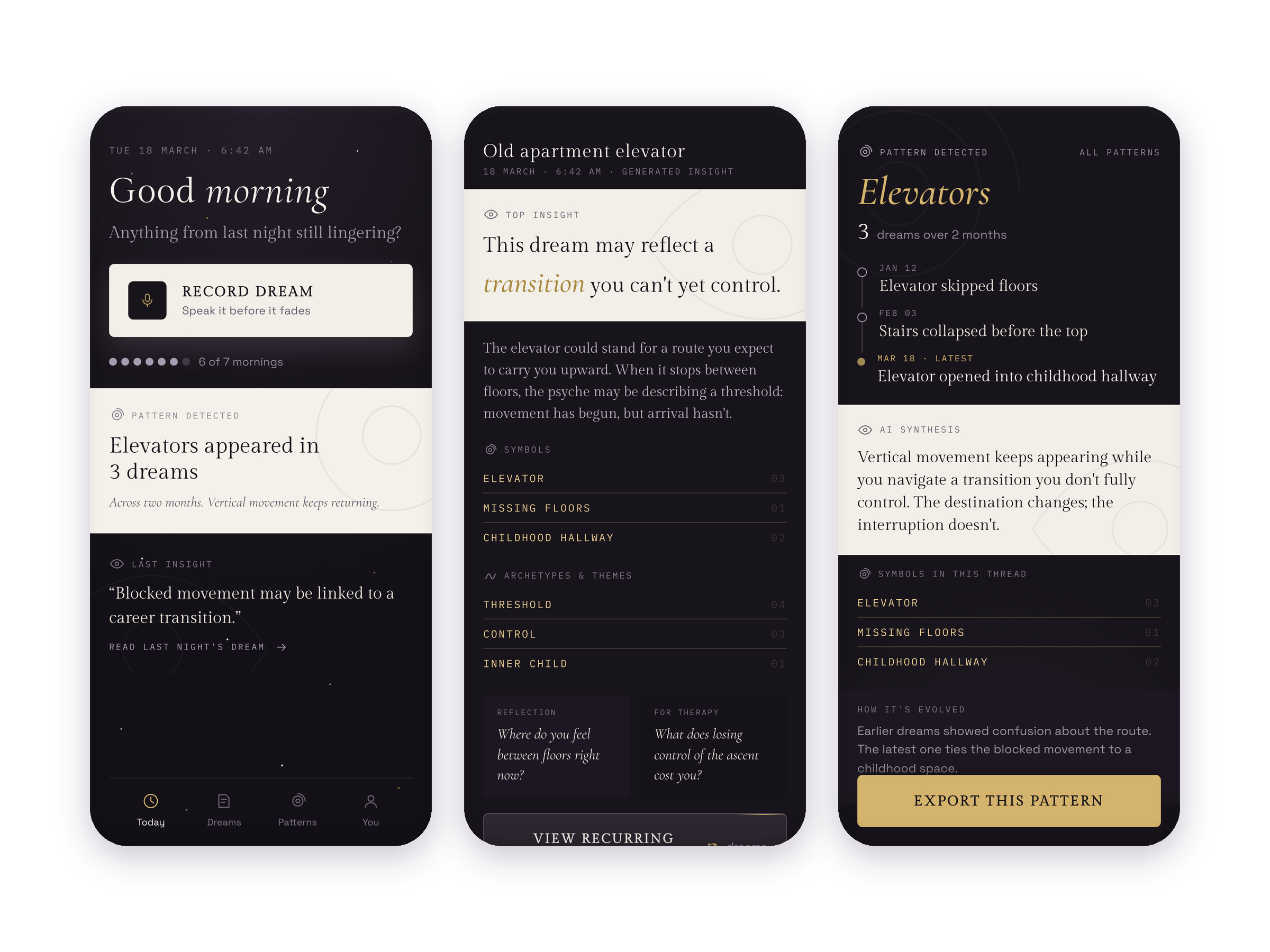
01 Interpretations are possibilities, not verdicts
Dream interpretation is inherently subjective.
The product therefore should not behave as if it knows what a symbol “really means.”
Instead, interpretations are framed as possibilities: something to consider, question, connect to personal context, or reject entirely.
The AI is there to open a line of inquiry, not close it.
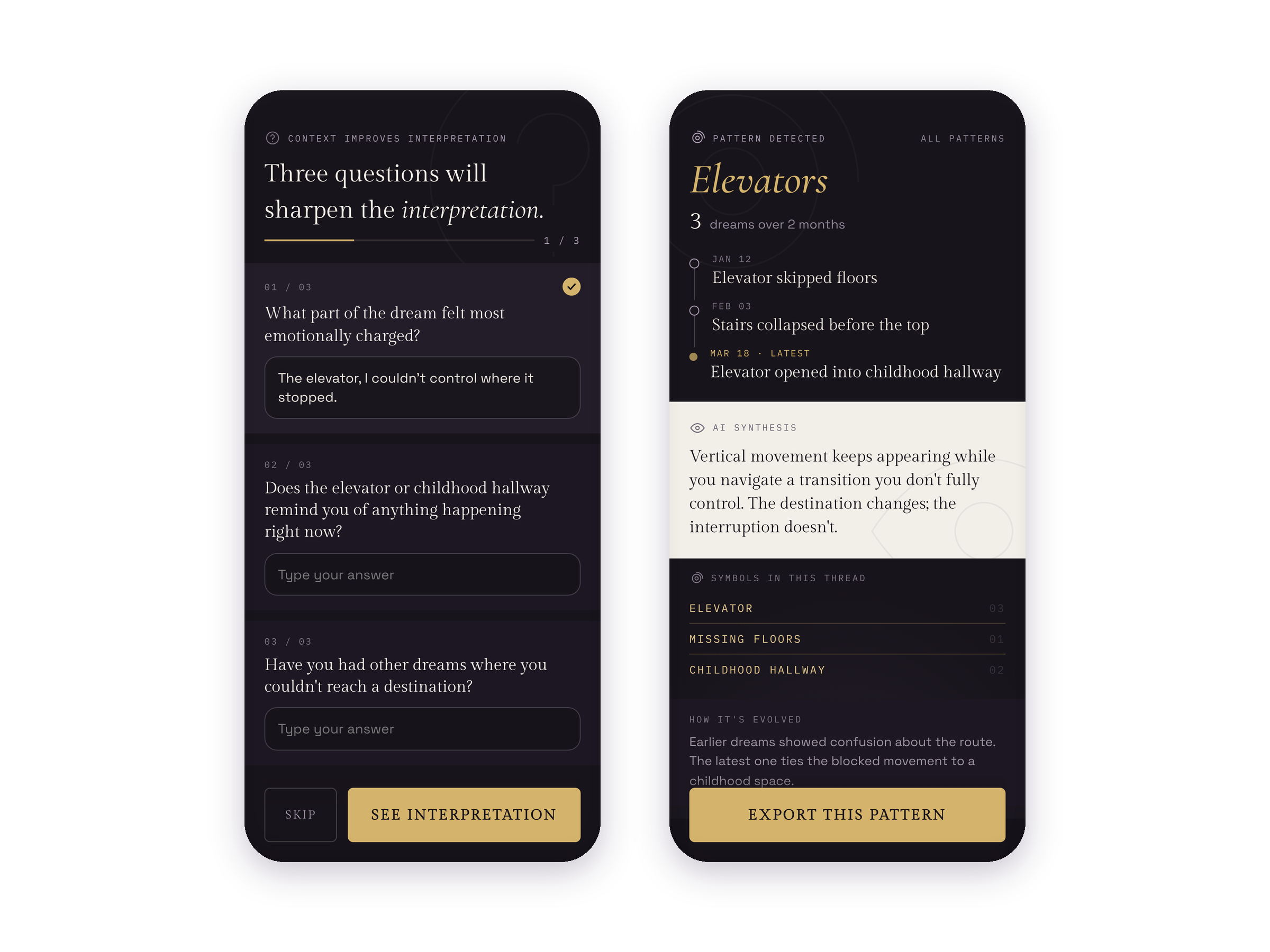
02 Context matters more than an isolated prompt
A single dream can produce an interesting response. A useful reflective product needs more than that.
Dream Thread preserves relevant context across entries so recurring themes, images, emotions, and patterns can become visible over time.
The value shifts from: “Tell me what this dream means.” to: “Help me notice what keeps appearing.”
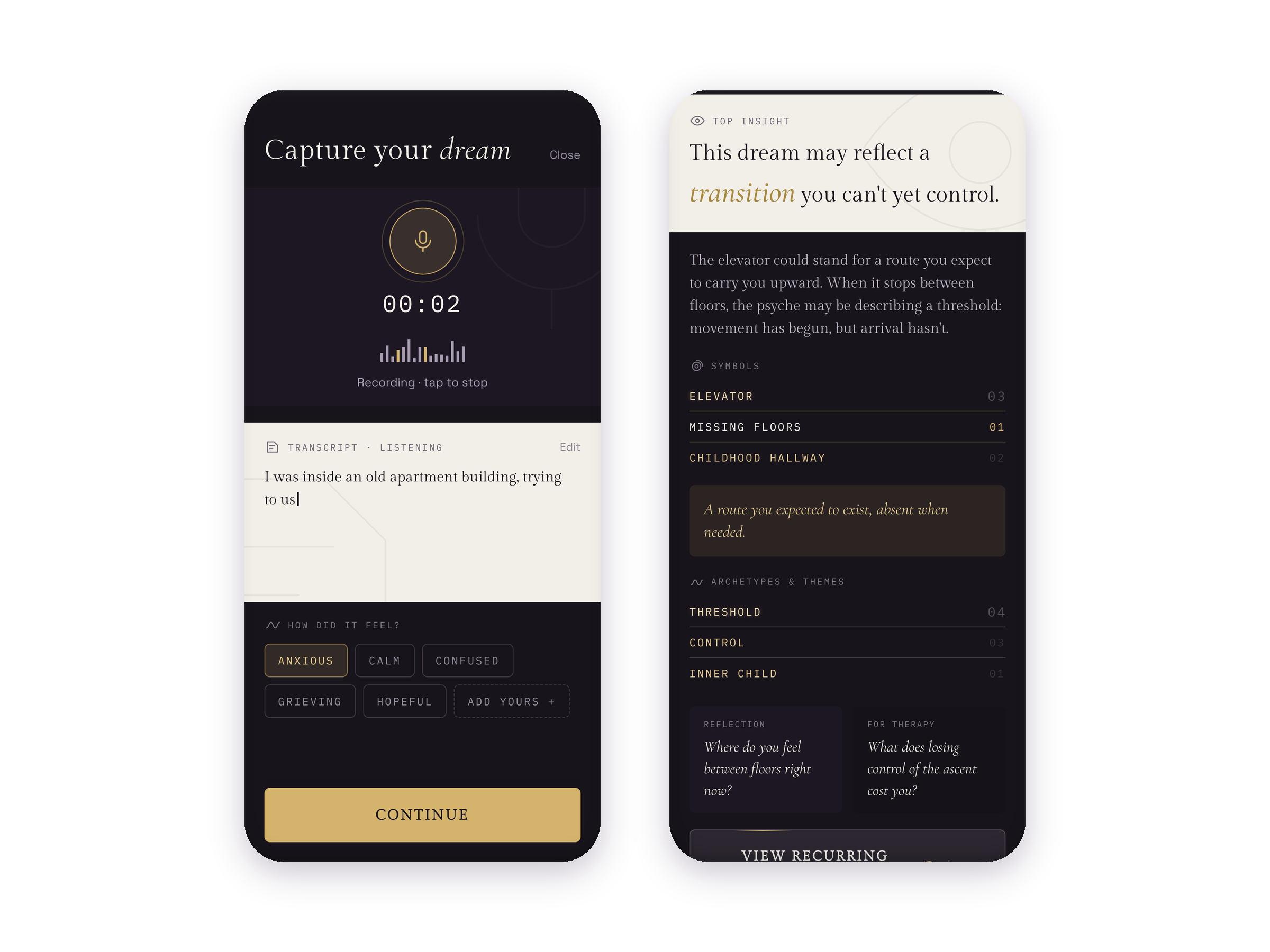
03 Preserve disagreement and ambiguity
AI output can sound emotionally appropriate even when it is generic, overconfident, or simply wrong.
I wanted the interaction to leave room for the user to question an interpretation, add context, follow a different thread, or reject the suggestion altogether.
That keeps meaning-making with the person rather than quietly transferring authority to the model

What I would test next
If I continued the concept, I would focus less on whether users find an interpretation “accurate” and more on whether the interaction helps them:
notice personally meaningful patterns,
reflect without feeling directed toward a predetermined conclusion,
understand the limits of the AI response,
and retain control over what context is stored or revisited.
AI accelerated the prototype.
Not the thinking.
AI helped me explore questions, content structures, interaction states, and working prototype logic much faster than I could have produced them manually.
I still had to decide what the system should ask, what it should remember, where it should qualify an answer, and what it should leave unresolved.
That distinction became one of the most useful lessons from the experiment.
This is a conceptual decision-support prototype. Recommendations and operational data are illustrative.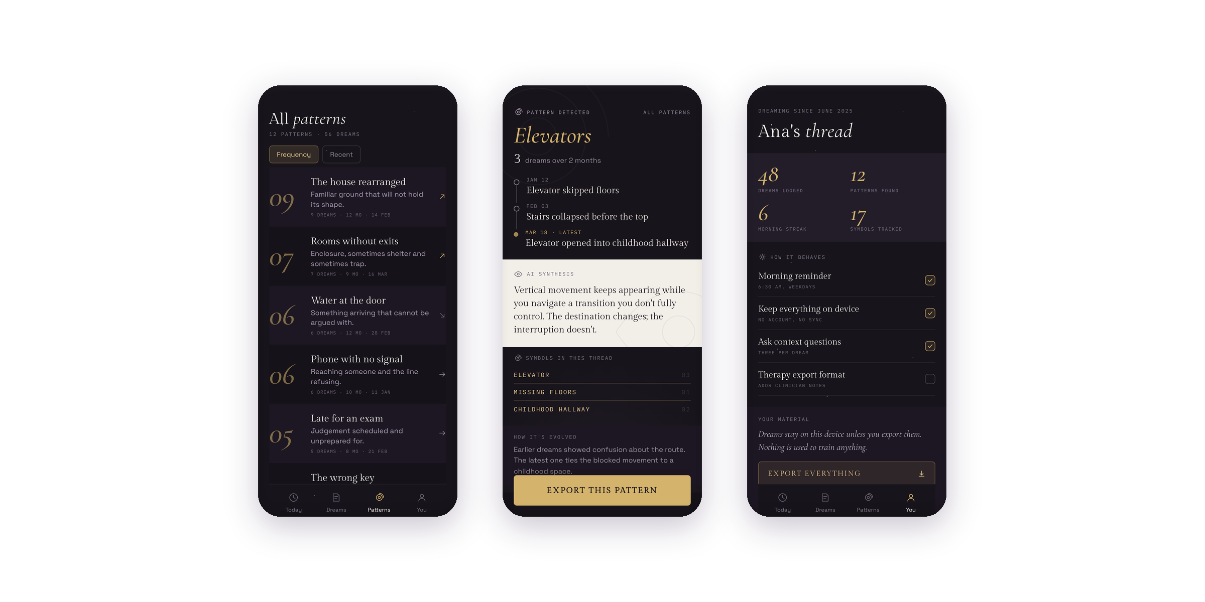
More from the lab.
Smaller experiments
Not every idea needs a full case study. These smaller prototypes let me test one product question quickly, make it tangible, and decide whether the idea deserves more depth.
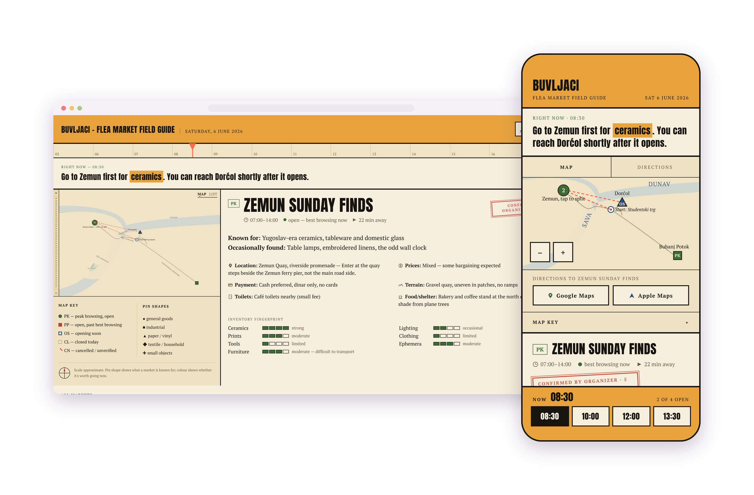
Buvljaci
How could discovering flea markets feel less like searching a directory and more like finding something worth exploring?
A marketplace-discovery experiment around location, timing, browsing, and the character of physical markets.
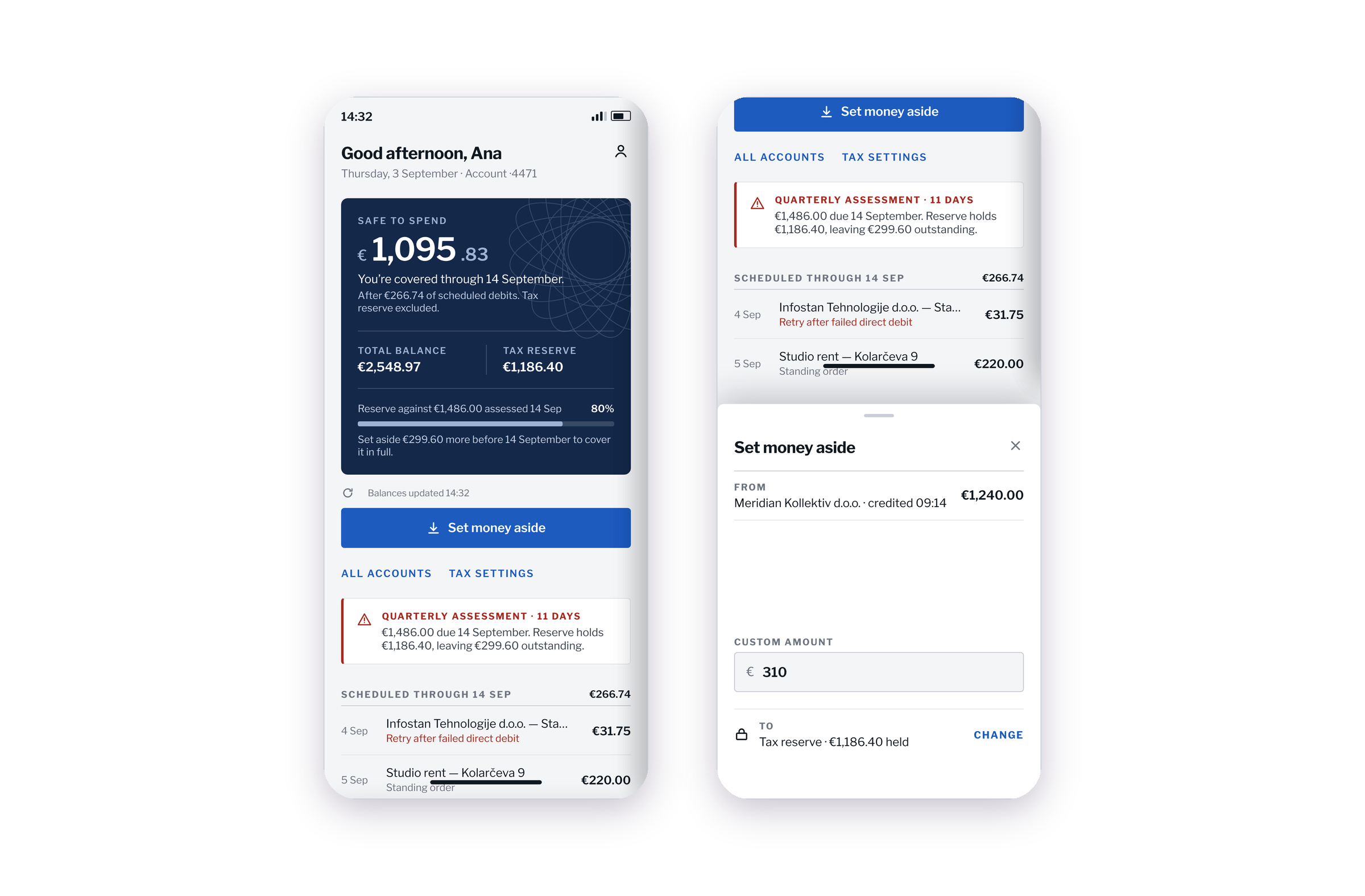
Tax Reserve
How can a product make future tax obligations feel concrete before the money is accidentally spent?
A financial planning concept exploring reserves, timing, and the difference between available cash and money that already has a future purpose.
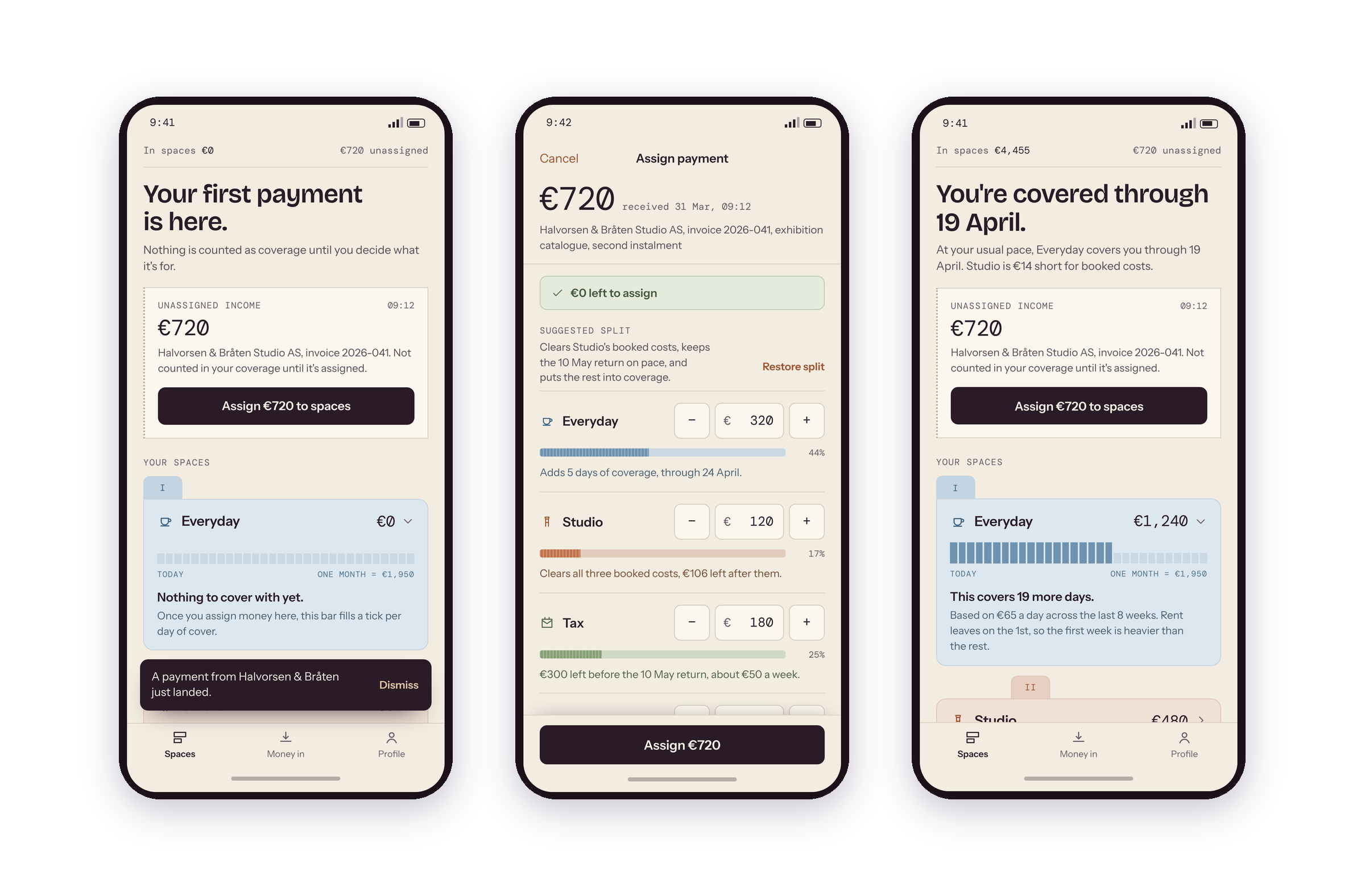
Spaces
How might freelancers separate money by purpose without creating the overhead of managing multiple accounts?
A concept for organizing income into clear functional spaces while preserving visibility across the whole financial picture.
Experiments help me move quickly. Shipped work proves what holds up.
The AI Lab gives me room to explore ideas without production constraints.
In professional product work, those decisions have to survive much more: real customer needs, accessibility requirements, technical dependencies, design systems, stakeholder alignment, implementation, and post-launch behavior.
That is where most of my work lives.